Hello! A friend asked me to make a sympathy card, and this is the result. The main panel is sponged with Distress Inks (Scattered Straw,Victorian Velvet, Seedless Preserves, Chipped Sapphire and a tiny bit of Black Soot) on very smooth cream cardstock. Next, I misted a pretty damask background stamp (Hero Arts) with with water and "stamped" it on the distress ink. It gives a very pretty, subtle effect, and the more ink you have applied, the more striking the effect is. I heat set the panel before embossing, and stamped the flower (Penny Black) in black pigment ink and embossed it in black. Where possible, I like to use the same colour of ink to stamp as emboss in case there are any gaps in the embossing powder. Of course with semi-opaque and translucent powders you can use other colours for interesting effects too...but that will be a project for another day! I added a few impressions of the same flower in Chipped Sapphire as well as a border stamp (Stampers Anonymous - Tim Holtz) on the bottom in Wild Honey. The card base is Naturals Ivory (Stampin' Up) and the accent strips are two shades of purple (an eggplant, and Stampin' Up's Rich Razzleberry). The eggplant strip has the same damask print stamp used with Hero Arts shadow ink in Raspberry Jam. I like these inks for stamping on dark cardstock because they are semi-opaque, like chalk inks, and you see the colour interactions. A pinkish dye ink would get lost on the dark purple, but the Shadow inks sit on top and add a luminosity to the paper that appeals to me. To finish it off, I added three dots of Adirondack Liquid Pearls in Eggplant. They went disastrously wrong so the whole effort had to be peeled off the card base and applied to a new card base and more care and attention applied to the squeezing and placing of the dots.
Thanks for stopping by!
Showing posts with label Penny Black. Show all posts
Thursday, 5 March 2015
Sunday, 5 January 2014
Happy New Year!
Hello and Happy New Year! It's the last day of our Christmas vacation today and we have been enjoying it in our various ways. The girls went tobogganing this afternoon and DH spent some time playing some music. I've been puttering in my stamp room, trying to clean it up. It was getting really out of hand, plus I just got my knitting corner cleaned up and was feeling industrious. My main objective was to clean off my cutting area (done) and the work area of my desk (mostly done). I need to clean off the rest of the table, but the day is only so long and my family keeps wanting meals. Still, I may get it done yet - Downton Abbey doesn't come on for another four hours ;-)
One big job I did get done was to sort through all my scrap hoards. I wanted to get rid of old scraps I am never going to use and corral the scraps I will use. I made myself a little box of items that will make quick cards, so that's where this card comes in. I ruthlessly recycled designer paper I don't like, tiny pieces, false starts to cards and an interesting fold card I have been keeping around for years as design inspiration. I finally decided that if I haven't been inspired to make one like it for this long, I am unlikely to ever make it. And if I am ever overcome with the need to make one, Google and/or You Tube will help me out. I'm sure all of you fastidiously neat and minimalist stampers out there are finding all this rationalizing and explaining hysterically funny. For the hoarders and savers out there, you know what I'm talking about and I'm sure you are keeping every scrap of paper on a just-in-case basis too. Well, I was able to weed out a lot of old scraps that were just discouraging my creativity instead of sparking it so I am feeling better about ditching them. As a little reward for all this industry I allowed myself to make this little card.
I had made the ombre glitter hearts recently, trying to come up with my January class samples. This one didn't make it, but I thought the glitter hearts were too pretty to pass up. I used four colours of Be Creative glitter, with double stick tape behind the opening left from die-cutting the hearts with a Memory Box die. I cut a second shape out of red, to put in the opening before I added the glitter. I used Pink, Rose Copper, Apple Red, and Merlot glitter. The panel is mounted on red shimmer cardstock, and the card base is Pirouette Pink (Stampin' Up). The sentiment is from "love chapter" (Penny Black) and the xo is added by hand in metallic pen. It's an odd shaped card, but with my new envelope punch board, I can make any size envelope I want! I think I have some red heart wrapping paper in the wrapping box, which will make a great little envelope.
Buoyed by the success of my October stamping challenge, I am going to give myself a January challenge - to use something from my newly sorted scrap boxes and make something every day and post it to my blog. How about you - any crafty challenges you want to set for yourself this month?
Sunday, 22 December 2013
Christmas card
Hello! Here's this year's Christmas card - kind of ran out of time for more. I'm sure people can relate to that! Normally I try to put "make Christmas cards" on my to-do list so that I can carve out some time for myself in the mad run up to Christmas, but this year I was taking a quilting class, so I was already carving quite a bit of me-time out and didn't feel I could add stamping to that. Well, my class quilt top is done, and I did have a bit of time to make some Christmas cards to send out this year.
I used a design from a class I took at Heather's Stamping Haven from my friend Mary. I loved this card. I made a tiny change - sponged the focal panel instead of using wrinkle-free distress. I thought it would be a bit faster. The ornament stamp is a Penny Black cling stamp from the set "ornately". I coloured it with Tombow markers and misted lightly before stamping. After it was dry, I added some clear Wink of Stella to the ornaments. The snowflake on the black strip is also from the "ornately" set and stamped in Delicata gold. The background panel is stamped in Red Royal (Hero Arts) using a Penny Black background stamp called "christmas story". The whole thing is mounted on a black linen card base and I used Delicata gold to stamp the greeting on the inside. I really love Delicata gold for stamping on dark cardstock - it is crisp and clean and dries right away. Tsukineko people - if you are reading my blog - please, please make us a Delicata silver too! Please!
Well, this blog post must come to an end. It was off to a shaky start since I couldn't log in to Google the way the accounts are set up. So my blogging time did get a bit eaten up by technical contortions.
I hope you get some time to stamp over the holidays. I have high hopes of some quality time at the craft table myself! I will be working on my January class sample for sure - will feature Penny Black stamps in the theme of Love. Perfect for Valentine's Day, anniversaries, wedding cards, etc. I have a lovely little stack of cardstock all picked out and ready for experimenting! But I am not going to rush into post-Christmas thoughts. I am going to enjoy the moment and anticipating the celebrations to come.
Happy Stamping!
Wednesday, 30 October 2013
October Stamping Challenge #15
Hello! Here's another quick tag for my October stamping challenge. I was experimenting with different ways to use this holly stamp (Penny Black) combined with Tombow markers so I cut this one out and mounted it on some scraps of paper leftover from layout auditions for my November class. The focal image here is embossed in black, watercoloured with Tombows and accented with stickles and Wink of Stella brush pen. I used my new Pine stickles - Ranger has some new colours out. They have needed a new green for a while - Lime Green and Crystal are fabulous, but I was ready to have something that could go on darker colours. I really love this new colour and can't wait to see the rest of them when Heather gets them in.
Thanks for stopping by. One more day of my stamping challenge!
Thanks for stopping by!
Thanks for stopping by. One more day of my stamping challenge!
Thanks for stopping by!
Labels:
October Stamping Challenge,
Penny Black,
tags,
Tombow markers
Tuesday, 29 October 2013
October Stamping Challenge #14
Hello! Here's my latest stamping challenge project - a quick little tag. I used some leftover parts from my explorations in making my samples for my November class at Heather's Stamping Haven. The class will be on November 30 from 2-5 pm. The class projects are show below and my class is called Wink of Christmas because I have been trying out the Wink of Stella glitter brushes! They are a lot of fun and add a different sort of shimmer than stickles or twinks. I quite like them. My class also uses a great set of Christmas stamps from Penny Black. Hope you can join us!

The other stamping things I have been doing this weekend are Krista's classes! I haven't taken a picture (yet) of all my projects, but you can see them on Krista's website here. If you click on one of the thumbnails, it expands the picture to a see-able size and you can scroll through. We had such a good time! Krista teaches a variety of colouring techniques: Tombows, Distress markers, Copics, and Inktense pencils. It was a blast and the other ladies always make it such a special time. A great big thank you to Krista, Heather, and all the other ladies for a wonderful weekend!
Well, all this stamping goodness is the reason I have been away from my stamping challenge. I gave myself a pass since I was spending so much time doing other sorts of stamping. I think my family might have really rebelled if I had spent any more time stamping and blogging!
Well, time to dash off to work here. Hope you had a good weekend too and found some time to get inky!
Happy stamping!
Sunday, 13 May 2012
Mother's Day Card
Hello! Here's a card I made recently, but didn't post because it was for Mother's Day. I guess that doesn't make a lot of sense since I stamped it with my mother while she was visiting. Oh well, that's my trademark - not making a lot of sense!
Mum and I were playing around with Fantasy Film from the Art Institute Glitter folks. It's wonderful, iridescent, shimmery stuff. This is an Art Institute dragonfly stamp, and I followed the directions on the package to stamp and heat with an iron. It doesn't show from the scanned version, but in real life, I made two layers for the dragonfly wings. The background is distress ink and the bull rushes (Penny Black) were stamped by colouring directly on the rubber with Tombow markers and spritzing. The sentiment is a Stampin' Up stamp and the circles are from Papertrey Ink.
My own Mother's Day has been lovely. Hubby and the girls made me breakfast this morning: pancakes with sauteed apples (from DD2s new kids cookbook), fruit salad with lemon yogurt sauce (delicious Barefoot Contessa recipe), bacon, coffee, and juice. The table was set beautifully, complete with a bouquet of roses, a bouquet of handmade flowers, handmade cards and a poem. Then off to church where the junior choir sang a lovely anthem, then out shopping in the afternoon for some summer clothes with DD1, then out for dinner, and then a nice bike ride on a balmy spring evening. Now home for the evening routine and a quick blog post while the kids do a bit of tidying. It's also the 18th anniversary of the day hubby and I met. Now that's a lot to be grateful for in just one day!
Friday, 2 December 2011
Christmas Card
Hello! It's been way too long! Since I've last posted, there was the church bazaar, my daughter's birthday party, my daughter's family birthday party, my parents' visit, and the hurly burly of daily life. Good things, all, but no time for blogging, and precious little for stamping.I had gotten this stamp and the Christmas colours of Distress Ink at Heather's recently and I really wanted to try them out. It's a gorgeous brush stroke poinsettia (Penny Black), with a holly sprig. I've tried it a few different ways, but here I started with a piece of sage green, sponged in some Iced Spruce and stamped on the old script (Impression Obsession) in Memories Soft Gold. Then, the poinsettia on top in Delicata gold (that stuff is fantastic! dries instantly on porous paper - cue foreshadowing music here), the Merry Christmas (Heather's Stamping Haven) in black. Doodled a frame with a Micron too. I edged the panel in the gold ink too. This piece is n a dark grey linen mat, then a lighter grey linen card base, on which I stamped the poinsettia again, this time in a sage pigment ink. The accent bit is a piece of Ionize metallic paper (my new favourite since Krista's class this fall), which I zipped through the Cuttlebug (why don't I have a holly folder????) and applied more delicata ink. Most of the ink is off my fingers now, the next day, and I found that delicata will eventually dry on metallic paper, but not quickly enough not to make a bit of a smudgy mess. Next time I will set it aside to dry for five minutes or so. The final element was some artful application of Champagne Stickles, mostly in the centre, but also here and there, as I've been seeing done with sticky-back pearls on lots of blogs. This will mail more easily, and helps put a tiny dent in my stickle supply. Well, this card has been percolating for a while, and it was good to get it out. I might make a few more tweaks to size of panel, etc,., but I think this is in the running for one of my Christmas card batches this year!
Thanks for stopping by.
PS Sorry about the wacky formatting - Blogger updated their interface while I wasn't looking and I don't have time this morning. Really I should be getting everyone ready for the day and not blogging, but there you go. We'll compromise with wacky formatting and a mad scramble for the bus.
Wednesday, 20 July 2011
Wedding card

Hello! Here's a card I made for a lovely person at work. She's getting married this summer, and I wanted to make a card for everyone to sign. I used this beautiful Penny Black image and heat embossed it and added colour with Twinkling H20s. Her colour scheme is shades of green, so I went with fresh shades of green on the card, with white embossing on ivory shimmer for the panel underneath (Stamp: Bella Toile, Stampin' Up). I accented with some glitter and pearls here and there as well (click on the image for a closer look). The scan doesn't do it justice - it's very elegant and shimmery in real life.
Thanks for stopping by!
Sunday, 22 May 2011
Penny Black challenge

This week's challenge at the Penny Black blog is to make a decorated envelope. I thought the brushstroke stamps would be perfect for this, so I made a few different ones until I got one I liked. (Note to self, don't start with Fabriano cards until you have a good system down!) I painted the stamps with twinkling h20s and misted and stamped, repeating a few times withing re-applying colour. I thought it would be nice to make a card while I was at it, so here's what I came up with.
I really, really love those brushstroke images. They are some of my favourite stamps and it's a pity they're so hard to find here in Canada. Whenever I see one, I snap it up.
I was inspired by the work of Rachel Jackson, whose work often appears in Craft Stamper magazine. Her work is characterized by lots of white space, interesting texture, bright colour, and a certain element of splatter or paint. I was going to go simple on this, but then I thought of the article I just read by her that had interesting text blocks stamped in unusual places so I thought I would give it a whirl. I'm not sure if I like how it turned out, but I like it well enough to use it. I think I will keep experimenting with her approach, which is sort of clean-and-simple meets mixed media. Craft Stamper is a great magazine, but it's also hard to find here. Again, whenever I see it, I snap it up. I'm debating about subscribing, but it's from the UK and quite expensive.
Anyway, back to the card. I added a frame with my Micron, matted the whole thing onto some grey cardstock, and then on a moss green tsumugi card base.

This envelope was stamped in the same way, but with the dragonfly too. He's stamped in Black Emerald twinks, and the same purples and blues for his wings, but without the pomegranate. Black Emerald is THE colour for dragonflies. It's black, but dark green when the light catches.
I don't know what it was about yesterday, but it was a day for paint in our house. The girls spent a long time painting, and got themselves completely covered in paint. And the table, and the floor, and the bathroom when they tried to clean up. It was a monumental mess and they got into a monumental heap of trouble for the series of poor judgment calls that led to the mess. Fast forward to 9 pm when I am stamping away, and dip the hem of my t-shirt into a pot of Rainforest green twinkling h20.... I sigh (it won't wash out) and note the irony. Fast forward to 9:10 pm, when I knock that same pot off my desk and it bounces on the floor, upside down and makes two big spots of dark green on our light coloured carpet under my stamp desk. An interval of intense scrubbing and muttering followed and I got it pretty much out. Luckily our carpet is made of some frightening fibre that repels twinks. I guess the previous owners didn't splash out on wool carpet. Anyway, the irony of the situation wasn't lost on me..... Here's hoping our house isn't in the grip of a similar force today.
I will leave you with the best rapture comment hubby found on-line: "People are making rapture jokes like there's no tomorrow."
Thanks for stopping by!
Sunday, 10 April 2011
Colouring with Copics
Hello! Here's a card I made out of a piece I coloured up with Copics one evening. I couldn't get it to scan well - in real life it'q quite soft and pretty. On my monitor it looks a bit garish. For a reference, the cardstock is PTI's lavender moon, and the background paper is from the Kioshi line (BasicGrey). The stamp is by Penny Black (gossamer?) and I stamped it in either Memento tuxedo black or Brilliance graphite black (heat set). I did up a batch of different images and used one or the other ink since my little Memento was drying up. (I have a reinker now! Yay.) Anyway, I played with the Copics trying to go for a soft purpley pinky orange look to the petals, which was somewhat achieved in real life. I am less happy with my choice of stickles, but that's ok. Another doodled frame, which I seem to be doing quite often. This is one of my favourite images from Penny Black, but I think I say that about all of them.
I have a few different projects on the go at the moment. I picked up some Shimmer Sheetz and am playing with those at the moment - lots of fun and lots of possibilities. I am also working on my May class sample, a few ideas there and some of the ideas even seem to be going somewhere. I have no trouble stamping when I can just sit down and play. When I have to use a certain thing, I often get a creative block. It's weird.
****One last thing, if you're in the area and want to take my class on Saturday morning (April 16th, 10-12), please call Heather to sign up. I'll be showing how to do quick and easy collages by turning ATC-sized stamps into cards. There are a few little special touches for adding texture and dimension that may surprise you. Give Heather a call by Thursday to register.
Thanks for stopping by!
Saturday, 18 December 2010
Christmas Cards

Hello! My apologies for being such a delinquent blogger. I don't know how people blog every day. Maybe if I didn't read other blogs, I could work on my own. But there are so many wonderful other blogs out there, how could I not!?!
Here's a card that I recently made (as in last night). It was quite quick to put together so I think this might be a candidate for some batch cards next year. It's for someone who loves glitter and shimmer paper, so I used both. I started with some navy shimmer paper and stamped the image (Snow Dust by Penny Black) and sentiment (Cornish Heritage Farms) with white pigment ink and embossed with a mixture of white embossing powder and warm highlight Glitter Ritz. Then I matted it on some white, and popped it up over a navy shimmer card base. I thought it would be nice to extend the dots, so I used a fanatstix stick to daub on some dots of white ink again and embossed those. I added some Star Dust stickles to the snow dots and the trees, and a rhinestone star to the "i" in Christmas. I like how the "t" in Christmas sticks down like a tree trunk (and a cross for that matter, but I am speaking for a design perspective here). This card is quite wonderful in real life (is that terribly immodest?) and the scanner can't really pick up all the shimmer. You'll just have to try one yourself and see!
I love this stamp. I see so many possibilities for spring (cherry blossoms), summer (leaves) and of course, autumn. And it's so perfectly laid out for wham-bam-image and whamitty-bam-bam sentiment, bob's your uncle, done. Gorgeous and quick and easy. Love it!
I hope you are well, and not getting too crazy. Remember to keep stamping on your to-do list at all times! Then you get to stamp and not feel guilty about it!
Thanks for stopping by!
PS A huge thank you to that very nice lady who gave me the coupon a couple of weeks ago. I got some great new colours of Adirondack paint dabbers, which I can't wait to use. Thank you!!! :-)
Sunday, 7 November 2010
Scrap Stash Sunday 8

Here's something I whipped up in my extra hour this morning between getting up to chivvy DD1 out the door to Junior Choir and remembering it's daylight savings Sunday.
I had made a few of these images for my entry into the Penny Black octoberfest contest, so I had some in my scrap basket, along with this snowflack embossed background. The bow was even pre-tied and on my desk demanding to be used. The image (Penny Black) was stamped in Majestic Blue versafine ink onto smooth white cardstock. I put a layer of double tack sheet on top and burnished in Glitter Ritz ultrafine (cool highlights). The effect in real life is so beautiful that it almost makes you feel bad that it was so easy. Almost! One shimmery white mat and a white card base later, and I'm done. And with time to spare to post! I love scraps!
By the way, a big thank you to the ladies who came to my class at Heather's Stamping Haven yesterday. I had a great time and it was lovely to see you, and I really appreciated that many of you travelled quite a distance.
NSR Hubby and I went to see the last movie in the Millennium trilogy last night, The Girl Who Kicked the Hornet's Nest. It was really good. I came out of the movie feeling like I could speak Swedish! Between the Millennium trilogy and a childhood spent watching the Swedish Chef on the Muppet Show, I should be able to trot out a few words. Sadly, no. And there was even time after the show to go out for a cocktail at Milestone's. It was lovely.
Sunday, 31 October 2010
Winter Scene

I made this card for Penny Black's Octoberfest contest using Christmas stamps from this season's new releases. I stamped the snowy scene in Versafine on whisper white cardstock, and matted on navy. The trick there was to put double tack adhesive over top of the whole thing and apply cool highlights ultrafine glitter (Glitter Ritz) to the panel. The shimmer has to be seen to be believed. The sentiment is stamped on shimmer paper. The cardbase is white linen, with a Penny Black botanical stamped in Brilliance platinum. The whole effect is very cool and shimmery and if it's a random draw, I have a good chance. Otherwise, the comptetion is very stiff. There are tons of great entries in the contest.
Happy stamping!
Sunday, 17 October 2010
Glowing Colour Wash

No scrap card today. I had to work most of the day, then tried to spend some time excavating my stamp desk. I did manage to clear a path towards it, so that's a start. I'll post one I made Saturday night instead.
This card features a brand new Penny Black stamp (yum!!!!), well new to me. Also new Adirondack Color Wash sprays. Double yum!!!
I got some new sprays recently and wanted to try them out. I covered the top of my deep freeze with packing paper, but an old towel would do. Then I spritzed a bit of paper (about 1/4 sheet, just grabbed a couple of plain whatevers from beside the cutter) with water, then some Adirondack color wash (wild plum, butterscotch, cranberry) and smooshed another piece of paper over top. Peel gently apart and wait to dry. You could do that, or you could rush over to your heat tool and dry them off to see how they're going to turn out. That's what I did. They will curl up, but they flatten out again. You can always iron them to flatten them out. (Which is what irons are for, right?) Once I had my piece dried off, I stamped a new Penny Black (Carefree Smiles!) repeatedly in black pigment ink and embossed in black. Matted on some black paper and then spent ages trying to find a paper to mount it on. The washes are so vibrant that they can really suck the life out of the background cardstock. I settled on this delicious tsumugi. It's richly pigmented so can stand up to the wash. I couldn't find an accent piece, so I trimmed the butterscotch bit off the end of another washed piece. A bit hard to do, since that piece was scrumptious, but if I am going to enjoy these washes, I need to get used to using the paper. That bit of butterscotch behind really adds a nice accent. I added the message stamp at the bottom (Sunshine Designs - The Stamp Barn) and some black accents (Ranger). Then today I added some white accent lines with gel pens and realized that however much I might want to be Michelle Zindorf, Queen of White Gel Pen Accents, I am not Michelle Zindorf, QWGPA. Still, my daughter liked it better with the gel pen accents, and I think I do too. It's always hard to know when to stop, especially with irreversible things like liquid accents and gel pen.
I am in love with these washes! They just glow. I am going to experiment with some resists next. Good times!
Sunday, 26 September 2010
Gothic Arch #3 - Crowns

This arch is for the Inkurable Stampers Gothic Arch Challenge #3 - Crowns. This arch started the background, where I began with some watercolour paper and the crown (Stampin' Up) stamped in white paint. I sprayed on some water and colour (Eggplant, Cranberry, Butterscotch Adirondack Colour Wash) and heat set. I had to rub the colour off the crowns a bit - the paint doesn't do the same level of resist as clear embossing. Then I stamped on the flourish (Stampers Anonymous) in Dusty Concord and the crown in Encore Gold. This background was so colourful that it needed something bold to go on top, and I remembered this frog princess stamp, which seemed to suit the occasion well. She's stamped on Heather's 180 lb paper in Graphite Black Brilliance ink (heat set) and coloured with Copics. The crown is adorned with tiny crystals and she is embellished with some stickles as well (Magenta on the lips, possibly a bit tarty for a real princess, but this one's in a mood for celebrating). I also added some clear glaze to her eyes to make them nice and glassy, which I guess is the froggy equivalent to false eyelashes. She needed a "ground" and velvet seemed a regal choice, so I embossed a piece of green velvet paper for her to sit on. The words say "celebrate your inner princess" (A Muse) and they are embossed in white gold embossing powder, for a very disco glitzy effect. (Not so much for this effect exactly, but because my gold powder, located only days ago in a big tidy, is currently hiding.) The brads at the top (Stampin' Up) started out silver, but I coloured it with my gold leaf pen (Ranger) to match the gold elsewhere. [I have been less than thrilled with this pen. Has anyone else had trouble with it? The paint just blobs out the side and won't flow into the nib. Any tips/suggestions?]
Well, better go make lunch for the kidlets. They are getting grumpy and squabbling upstairs. They were really good in church this morning, so I suppose I should feed them before things escalate.
Thanks for stopping by!
Labels:
colour wash,
Gothic Arch,
Inkurable Stampers,
Penny Black
Sunday, 19 September 2010
Scrap Stash Sunday 6

Hello! Happy Scrap Stash Sunday! There are a couple of scraps on this card - the card base (old olive) was in my folder, discarded from another project, the orange (oops) "flame" panel (for a certain someone averse to orange) was in my pile of scraps that are too nice to throw out. The curry tsumugi was a scrap on my desk. The focal image was purpose-stamped, and matted. No handy scraps of Early Espresso since I use every bit of every sheet. Love that stuff!
So about the card: the flower is Penny Black, inked with various colours of marker (I used Earth Elements by SU). I misted it with water and stamped it on watercolour paper. I might have misted that too, but maybe not. It was last week so can't remember. (This may be a hint that my plan to morph to sleek, efficient, organized supermom is running behind schedule.)
Anyway, I had stamped off a bunch of these flowers (lilies? anyone? sleek morph lady would know, but I don't) all at once since I don't really like colouring on stamps like that and misting and stamping but I really like the results. So I tend to do off a batch when I have everything out. (Am chortling to myself as that last sentence implies that there are times when everything is not out. hehehehe.) So as I was pondering how best to show this nice fall flower, my eye lit upon that scrap in my scrap box and it turned out to be perfect! I think I made it one time with wrinkle-free distress techniques, as a backdrop for some peel-offs. That plan went bust but I couldn't bear to throw out that nice autumn-hued scrap. I'm glad it found a home here. The buttons are coconut shell buttons from PTI, or at least the big one is. The little ones are regular I think. The sentiment stamp is SU from a new set, Just Believe I think. I like that one. It's so true. (This is why I'm not sleek morph lady, I spend time stamping and pondering all the things that I see because I believe. I think I'm happier that way, except for when I can't find school supply lists and receipts.)
Well, I should sign off - I have some work to do that's due tomorrow. SML would have it done by now, but she's not a stamper. The sooner I get my work done, the sooner I can hit the stamp room. I'm midway through my November class sample and it's looking good. I have the prototype done and I know what changes I want to make. Stay tuned :-)
Happy stamping!
Monday, 22 March 2010
Faux-toshop Fuchsia

Here is my first attempt at Cathie Allan's technique "photoshop without the computer". (Hence the really dreadful pun in my blog title. I would apologize but I'm not really that sorry.)
You can see the instructional three-part video, starting here. The technique relies on a great new stamp positioning device called Cathie Allan's Position-It. I took a class recently at my LSS, taught by Sharon Stead of The Stamp Barn and we made some really great projects. I was inspired to go home and try out this new tool to see if it lives up to the billing. In my opinion, it really does. I stamped at least a dozen times on that fuchsia, if not more, and it was perfect every time. If you are moving things around, it's a bit trickier to get that exact alignment, but when you want perfect layers, it is definitely achievable.
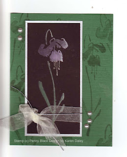
The basic premise of this technique is to stamp on black with pigment ink, starting with white and then adding colour, building up the layers. I used shades of pink and purple for the fuchsia (Chandelier by Penny Black) and green for the stem and leaves. I added a hint of silver at the end, which really made it pop. I loved this technique and I will be trying it again very soon. It is quite easy and lots of fun. It's best for big solid image stamps, unless you have the patience to repeat the same steps over and over for tiny stamps.
The layout is one of my usual layouts. I tried to go all fancy and interesting and it was really quite hideous. It turns out that taking a colour you don't like and adding other colours you don't like in papers you are trying to use up will result in a card with no redeeming features. It also turns out that Tombow Mono Multi cannot be pried apart (and I am the queen of prying apart disastrous layers). The only good part was I wound up tearing one of the ugly papers into tinier and tinier pieces that it was unsalvageable. (And I'm not talking a fit of pique either, this was artful tearing for accent purposes.) Anyway, I went with simple here, and instead of adding liquid dimensional pearls, I used little sticker pearls (Hero Arts), which have the advantage of being uniform in size and easy to position where you want them. They do seem to misbehave when no one is looking and rearrange themselves on the scanner. You can easily move them back and rescan and upload, or not. You could also fix it with digital wizardry in photoshop, but I don't hold with all that pagan claptrap, have sworn off it for Lent in fact. And it would verge on blasphemous to start photoshopping (is that even a verb?) a "photoshop without the computer" card.
So you could consider this a quick and easy card, with only one stamp and a couple of layers (and a bow! I forced myself to leave it on!) and only dozens of colours of pigment ink. Turns out I'm missing fuchsia pink - guess I'll have to go back to my LSS at some point ;-)
PS I now know how to spell fuchsia. In a devastating blow, I was defeated at gnilleps playing Cranium with my family, misspelling fuchsia backwards. Actually I would have gotten it wrong forwards too. But now I have added the spelling of that flower to my repertoire of words I can spell with confadence.
Thanks for stopping by!
PS Other supplies used not mentioned above: watermark (Top Boss), color box pigment and fluid chalk ink in far too many colours to remember, green tsumugi paper, brushed silver paper, Basic Black paper (Stampin Up), Offray ribbon, Stampin' Up silver cord.
Thursday, 21 January 2010
Prismacolor Pencils

Do you ever have a card that you just love! This is one I just love. The scanner couldn't quite pick it up, but the petals are so softely shaded. I just love looking at them. The paper was a perfect match too (Hot Off the Press Cardmaker kit). I've had that in my stash for a while and use it now and then - it's wonderful shades of blue and purple and pink.
This stamp (Penny Black - Gossamer) is a recent acquisition and I thought I would try it with Prismacolor pencils. I have tried them now and then and not really spent a lot of time experimenting. I watched some you-tubes on them and got some tips and tried them out. I have odorless mineral spirits and a stump to blend them out. I didn't find that the blending with pencils alone worked for me, but I have the Scholar variety of pencil and I don't believe they are as soft as the more professional pencils. The centres of the flowers have some stickles for a bit of sparkle on the card. The sentiment is a Stampin' Up rub on from the Chit Chat pack, punched out with a Stampin' Up punch. I edged with a bit of warm violet chalk ink (Colorbox). The flowers were stamped in India Ink (Memories) on whisper white. I didn't have any trouble with smudging, etc. and it is a very true black, great for the detail lines here. I used coordinating ribbon (also HOTP) and some lavender eyelets. The card is 5 1/4 by 5 1/4. I'll be needing a farewell card at work soon, and I sort of had this in mind for that purpose. Thanks for stopping by!
Monday, 20 July 2009
Pretty birdie!

I made a card in this vein a while back, but this one is definitely the quick and easy version. This one is the standard size (half sheet, folded). I started with some lovely new heavy weight smooth white cardstock and stamped Picotage Print in Versamark Dazzle and embossed with clear powder. I then applied several colours of fluid chalk ink, mostly with my small brayer, but I used the sponge wand too, and some cats eyes direct to paper. I stuck to purples and blues, but used a bunch of different ones to get depth. I would like to tell you that you can get the same effect with one or two colours, but it would be a lie. You would get a different effect and it might even be nice (I wouldn't know, not being able to use only a few colours, even if my life depended on it). But it wouldn't be the same. The colours I used are listed at the bottom.
Anyway, I merrily brayered and wanded and sponged and dabbed till I got a little too much colour on (sigh). Then I removed the embossing using a dry hot iron and stamped on the bird image (Song Bird, Penny Black*) in Dragonfly Black and embossed in black. It's mounted on black, then on a lovely piece of tsumugi paper. I couldn't decide which colour suited best, the purple or the blue, so in true Winnie-the-Pooh fashion, I used both so as not to be greedy. A few accents in the form of sheer ribbon (knotted, thank you very much) and pearl stickers. All in all, this took me less than half an hour to make, in part because I'd figured out the design and colour scheme already for the other card. But really, this type of card is quick to throw together, and you still get a bit of a wow factor. I spent the most time hunting down my pearl stickers.
Heather asked me to try this white paper and I have to give it two thumbs up. I like it as much as the heavy, heavy 180 lb paper that I don't know where to get anymore now that Western Educational closed. This new paper is slightly lighter weight (and probably easier on my cutting blades), but still has a good heft. I loaded the ink and none bled through. I also had good success embossing, removing and re-embossing. Not all papers are so cooperative. So, when all is said and done, I really like this paper. It's also sturdy enough to make a good card base when you want a white one. I'll be glad to have a local source of this paper!
Sources: Heavy white cardstock, Picotage Print, Versamark Dazzle and Colorbox Fluid Chalk, small brayer (Ranger), sponge wand: Heather's Stamping Haven. Penny Black: hard to find a Canadian source, if you find one, let me know. I think I got this from Addicted to Rubber Stamps. Tsumugi paper: Heather sometimes carries it (she got me hooked), and I bought this batch from California Paper Goods. You can also get it at The Papery in the Glebe (Ottawa), and if you go there, you should also check out their other Japanese papers (washi? yuzen?). I got some nice tsumugi square notecards with coloured envelopes. They are so gorgeous that I am battling my every hoarding instinct and even went so far as to consider using one as a card base. Baby steps, my little one, baby steps.
Colours of ink used: In case you are interested (or want to wag a puritanical finger at my wanton colour use): Ice Blue, French Blue, Prussian Blue, Wisteria, Warm Violet, Dark Peony, Blue Iris, Night Sky (all Colorbox except Night Sky, which is Versamagic).
Monday, 20 April 2009
Song Bird Sympathy

Sadly, I needed a sympathy card for a colleague this week. I wanted to make one that would be big enough for lots of people to sign when it goes around the office. (The finished card is 7 3/4" x 5 1/4 , which is 1/2" smaller length and width than the envelope.)
I started with a nice big piece of Papertrey Ink white, and stamped Cornish Heritage Farms Picotage Print Backgrounder in Top Boss watermark ink. I've read that this watermark ink doesn't make your stamps sticky like another brand does, so I thought I'd give it a try. I embossed with detail clear e.p. and brayered over with Ice Blue fluid chalk ink. Then I sponged in several shades of blue and purple (French Blue, Wisteria, Prussian Blue, Warm Violet, Blue Iris) chalk inks, leaving the centre nice and light. Then I removed the embossing with a dry iron, and sponged some Charcoal chalk around the edges to soften the white areas where the resist was. Then I stamped the song bird image with Dragonfly Black pigment ink and embossed with black e.p. This image panel is mounted on a black mat, which is mounted on a piece of dark blue Bazzill textured cardstock, with a torn edge. The sentiment is Cornish H.F. (Silhouette Blooms I), stamped in Onyx Versafine, which is ideal for capturing the fine detail of the lettering. The sentiment is punched with the large Stampin' Up oval punch mounted on a dark blue scalloped oval, punched with a must-have from the Occasions Mini. I edged the scallops with Brilliance platinum, just to define the edges a bit, especially where it overhangs the same colour.
The whole card is on PTI white because I wanted a nice heavy cardstock to hold up all that paper. I wanted the inside of the card white, but the front coloured, so I just custom-coloured it myself with my handy mini brayer (Ranger) and a pretty leaf stamp (Heather's Stamping Haven, 185CU). I brayered over with Wiseria, then a bit of French Blue, then stamped the leaf in threes and singles, and wanded in more French Blue around them. I brayered over in Alabaster (Cathie Allan's filtering technique), and heat set with the iron. I added a vertical row of Smokey Grey and Onyx (versafine) leaves, topped with Brilliance Platinum leaves. I felt it needed some more leaves out towards the edge, so I added some more, stamped in first- and second-impressions with Blue Iris. Some marker lines (Tombow) added some definition. Then I remembered I wanted to add some ribbon so I peeled off the bird panel, slid in some ribbon and stuck it back down. (This step is optional - you can remember to add the ribbon before you stick it down.) Then I carefully heat set the afterthought leaves, ironing around the panels. (Ditto for optional step - you can remember to heat set the leaves before you stick everything down. They don't have to be heat set, they just feel better to the touch when they are. And they dry faster, which reduces smudging, caused by not washing your hands after you sponge using the last clean side of an old sponge.... Now I have the world's grubbiest hands, or the best Colorbox manicure. It's all in how you look at it. Considering I have to meet with a very senior person at work tomorrow (who is extremely unlikely to be a stamping sort of person), it's looking as if grubby it is....))
I'll stop torturing you with convoluted sentences and diabolical punctuation now and upload the picture! The people who work with me that get my heavily edited for grammar and punctuation would never believe my haphazard, stream-of-consciousness blogs, with the most atrocious/imaginative (again, it's in the eye of the beholder) punctuation. That, my friends is the difference between scientific writing and the Interweb, where any sort of ink-fume-inhaling lunatic can hold forth interminably!
Thanks for stopping by!
Subscribe to:
Posts (Atom)


