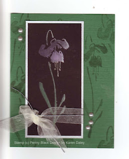
Here is my first attempt at Cathie Allan's technique "photoshop without the computer". (Hence the really dreadful pun in my blog title. I would apologize but I'm not really that sorry.)
You can see the instructional three-part video, starting here. The technique relies on a great new stamp positioning device called Cathie Allan's Position-It. I took a class recently at my LSS, taught by Sharon Stead of The Stamp Barn and we made some really great projects. I was inspired to go home and try out this new tool to see if it lives up to the billing. In my opinion, it really does. I stamped at least a dozen times on that fuchsia, if not more, and it was perfect every time. If you are moving things around, it's a bit trickier to get that exact alignment, but when you want perfect layers, it is definitely achievable.
The basic premise of this technique is to stamp on black with pigment ink, starting with white and then adding colour, building up the layers. I used shades of pink and purple for the fuchsia (Chandelier by Penny Black) and green for the stem and leaves. I added a hint of silver at the end, which really made it pop. I loved this technique and I will be trying it again very soon. It is quite easy and lots of fun. It's best for big solid image stamps, unless you have the patience to repeat the same steps over and over for tiny stamps.
The layout is one of my usual layouts. I tried to go all fancy and interesting and it was really quite hideous. It turns out that taking a colour you don't like and adding other colours you don't like in papers you are trying to use up will result in a card with no redeeming features. It also turns out that Tombow Mono Multi cannot be pried apart (and I am the queen of prying apart disastrous layers). The only good part was I wound up tearing one of the ugly papers into tinier and tinier pieces that it was unsalvageable. (And I'm not talking a fit of pique either, this was artful tearing for accent purposes.) Anyway, I went with simple here, and instead of adding liquid dimensional pearls, I used little sticker pearls (Hero Arts), which have the advantage of being uniform in size and easy to position where you want them. They do seem to misbehave when no one is looking and rearrange themselves on the scanner. You can easily move them back and rescan and upload, or not. You could also fix it with digital wizardry in photoshop, but I don't hold with all that pagan claptrap, have sworn off it for Lent in fact. And it would verge on blasphemous to start photoshopping (is that even a verb?) a "photoshop without the computer" card.
So you could consider this a quick and easy card, with only one stamp and a couple of layers (and a bow! I forced myself to leave it on!) and only dozens of colours of pigment ink. Turns out I'm missing fuchsia pink - guess I'll have to go back to my LSS at some point ;-)
PS I now know how to spell fuchsia. In a devastating blow, I was defeated at gnilleps playing Cranium with my family, misspelling fuchsia backwards. Actually I would have gotten it wrong forwards too. But now I have added the spelling of that flower to my repertoire of words I can spell with confadence.
Thanks for stopping by!
PS Other supplies used not mentioned above: watermark (Top Boss), color box pigment and fluid chalk ink in far too many colours to remember, green tsumugi paper, brushed silver paper, Basic Black paper (Stampin Up), Offray ribbon, Stampin' Up silver cord.
I love this card! I didn't see this post right away, as I was travelling at the time, but have now enjoyed Two! cards of yours at once, lucky me :-) And as much as the cards, or perhaps even more, your writing and sense of humour.
ReplyDeleteLove it, and you!
paperquilter aka wombat
PS AP and I will shorting be applying ink to paper, newly inspired!
Beautiful card! What is tsumugi paper and do you get it at your LSS? Nimmy
ReplyDelete