Thursday 30 June 2011

Summer Card Camp Week 1

Hello!

As you can see by the image below, I'm doing the summer card camp I saw advertised on Jennifer McGuire's blog (link in sidebar). This week's colour challenge is shown below and was a real stretch for me, as I don't normally go for such bright colours. But that's what challenges are all about - stretching creativity.


Here's the card I made, with a stamped image on Heather's 130 lb cardstock. I will have to check where the image is from, but I got it at Heather's Stamping Haven.


I coloured it with Copics, keeping to the scheme, and added some pencil crayon for depth, and stickles for sparkle. The orange piece is embossed, and the sentiment (Stampin' Up) is punched with an SU punch and accented with the perfect Swarovski crystals - they are pink or purple or orange depending on how you look at them. The card base is rich razzleberry and stamped with a dotty flourish (Impress Rubber Stamps).


Thanks for stopping by!

Wednesday 29 June 2011

This says it all (or at least some of it!)


I picked this up a while ago, and gave it to myself for my birthday recently. I loved this - it's by Anne Taintor and there are a bunch of great magnets and other gifty items like it. I got another one that says, "I always wanted to be someone. Now I realize I should have been more specific." Too funny.

I was a bit down about this milestone birthday, but thanks to the kindness and generosity and love and support of friends and family, I am enjoying it immensely. Hurrah indeed!

And I want to know where Anne Taintor got my picture.

Tuesday 28 June 2011

Thank you card


Here's a card I made for the girls' bus driver this year. He was particularly punctual and particularly patient when we weren't. Two excellent qualities in a bus driver. Bus drivers...they have the perfect job....all their problems are behind them! ar ar ar. Not my joke, but my favourite bus driver joke of all time.


I used the Hero Arts foliage stamp, inked with various shades of distress ink, misted and then stamped onto putty coloured linen paper. Then over stamped with a Cornish Heritage Farms text stamp (scrap block) in pumice stone. Sponged on some old paper and walnut stain around the edge and matted on brown. Dithered endlessly about layout, and eventually settled on this. I used a precious chunk of some paper a friend brought me from her summer holiday and one of her stamp store pilgrimages. It's beautifully textured, think of the seaweed you wrap sushi in. (If I weren't such a hick, I would know what that's called. If I weren't so lazy, I would look it up!) The bottom is card base stamped with the same foliage and tinted Rusty Hinge. I wrapped some linen thread and used one of my hoarded Asian coins. We must really hold this guy in high esteem - using up hoarded paper AND hoarded embellishments, all at once.


NSR. An emotional day at work. It was my farewell lunch, and some goodbyes to special people. It's not a big town and we may cross paths again. Indeed I hope so. Still, it's hard to say goodbye to somewhere I've worked for over ten years and step into the unknown. Wish me luck!

Monday 27 June 2011

Inkurable Stampers June Challenge


Here's my entry for the June challenge at Inkurable Stampers, which is Spots, Dots and Circles.


I recently took a great class at Heather's, featuring Glimmer Mist and I used that technique here, misting and spraying and bleaching out selected portions. I coloured some back in with pencil crayon too. I chose the bird image (Hero Arts) for the circles on it. I also added some paint circles, and the background has a circular motif on the stamp (Stampers Anonymous). The message (also Stampers Anon) is embossed in black. The paper is from a Tim Holtz pack, two sides of one sheet. And a little round clock brad to finish it off. In real life it's quite sparkly. I'm not sure about it - maybe the square is too square. Still, needed to get my entry in before the end of the month, which arrives early due to time zones in Australia being several days ahead of us here in Canada. (I love to say things like that to hubby, who is an engineer and immediately starts to explain the quantum mechanics of time zones and how it's not actually time travel, it's to do with the curvature of the earth and Sir Sanford Fleming trying to catch a train. It's at this point I normally tune out so I can't exactly say how time zones work, other than it's either much earlier or much later somewhere else, and will always be the wrong time to call.)


Thanks for stopping by!

Sunday 26 June 2011

Colouring, colouring and more colouring!


Hello! I've been doing some therapeutic colouring lately while watching tv with hubby. I stamped off a bunch of images (Sunshine Designs) with Memento Tuxedo Black onto Heather's 130 lb cardstock and coloured them different colour ways with Copic markers. Last night I had a few minutes while hubby was working on some committee stuff, so I took some time to turn them into cards. Basic formula: find matching cardbase and Basic Grey paper, mat, layer, etc. and finish off with Stickles and Dimensional Pearls. The big flowers got a sentiment in the white space (Stampin' Up). I think my favourite is the yellow flower card. My nephew's favourite was the blue flower card. I sprayed some Delphinium glimmer mist on the background paper for some subtle sparkle in the background. If you're interested, the coloured papers from top to bottom are: PTI lavender moon paper with pattern from BG Kioshi; Stampin' Up Really Rust with paper from BG Scarlett's Letter; Heather's dark purple cardstock (and a SU Sage Shadow mat) with BG LilyKate; SU So Saffron card base with paper from BG Perhaps.

NSR: Just finished reading a Kate Atkinson novel, Started Early, Took My Dog. It's the 3rd or 4th Jackson Brodie mystery and it was really good. Dark, but with great dashes of humour here and there. Also, her books always weave together numerous threads that are seemingly unrelated.

Saturday 25 June 2011

Make a birthday splash


Hello! Here's a card I made up over the past couple of days for a friend of my daughter's. She's having an ocean themed birthday, so I thought I would continue the theme with the card. The main stamp (Outlines) was stamped twice on watercolour paper and embossed, and coloured in with Tombows and blended. I tried to keep to the same colours on all the panels, but some are lighter and darker, just adding more markers to deepen colour if necessary. The card base (3 1/4 x 6 1/2") is a bright green (retired Stampin' Up), with a red and metallic yellow band. I used a background cover-a-card stamp (Fluff, Impression Obsession) on the background to echo the dots on the image. I didn't have time for stickles to dry before this card went to the party so I added glitter with my Sakura pens. There was lots of shine from the embossing too. I did two bits for the "splash" and the seahorse, cut out and popped up the second ones for dimension. The scan doesn't quite do it justice - in real life it's very vibrant. That's what I really love about the Tombows. Now if they'd only make a nice navy.....


NSR: It's strawberry season here and we had lovely strawberries and whipped cream and angel food cake for dessert tonight. Yum yum. I hope to get out soon and pick some to turn into jam. I didn't get to last summer, so I hope to remedy that this year. Also, thank you for the well wishes about the new job. I'm staying with the same overall organization, but moving to a different department doing a different type of work. So a huge change. It's going to be a big learning curve, but I think it will be good for me to try something new. I'll also be downtown, closer to interesting places to poke around in over lunch time, and lots of nice places to try for lunch. Also a great organic bakery between me and the bus stop (could be hazardous!). So lots to do between now and then, new clothes, new glasses (need new prescription), clean out old office, do handover, finish up what I can, farewell lunch, and all that sort of thing. It will be hard to say goodbye - many wonderful colleagues and friends there and many happy memories.

Thursday 23 June 2011

Birthday card


Hello!


Here's a card I made last night for DD1's dear friend's birthday. The focal image (Heather's Stamping Haven) is stamped and embossed on watercolour paper and coloured with Tombows using Krista Schneider's watercolouring technique. It's matted on black, with a little border doodled in. The card base is stamped with a daisy (Stamping Bella) and accented with patterned paper (Basic Grey) and Adirondack dimensional pearls in Butterscotch. The focal image is liberally accented with stickles, which really adds pop in real life. Nothing too out of my comfort zone here, but that's the way I like it right now. I'm on the brink of a significant change in jobs, so I'm way out of my comfort zone there. Some happy colouring time was just what I needed.


Thanks for stopping by! Happy stamping :-)

Saturday 18 June 2011

Steampunk Challenge


I made this card for this challenge on Hels Sheridan's blog. The challenge is to make something in the steampunk theme, and since her Sunday challenges are always based on a song title, this week's is "Sheena is a Punk Rocker". Since I am listening to nothing but The Ramones lately, I just had to play along. (Side note, DD2, age 5, always requests Rockaway Beach! I'm so proud...) I figured Sheena would want steampunk in shades of pink, so I used a pre-done Glimmer-misted sheet. (Hey, if people can turn Swiffer into a verb, I think the least I can do for the Queen's English is to turn Glimmer Mist into a verb too, and I think I can safely say I'm not the first and I won't be the last).


Anywho. Glimmer-misted sheet, cut with Tim Holtz edge, and stamped with Eiffel tower (Stampers Anonymous) in worn lipstick and socme clock faces (Stampers Anonymous). The glimmer sheet has a clock face (Tim Holtz) mask on it, to add to steam punk theme, though it's obscured and/or trimmed off, so you will just have to take my word for it. I think the Eiffel tower is steampunky- so many rivets! Beautiful lines, all made of metal, all it needs is some method of self-propulsion and it would be steam punk all the way. So there you have it. This might be more punk rocker than steampunk, so I added some fake rivets to the word panel (Stampers Anonymous). Also, what makes something more steampunk than sequin waste (cogged wheels and dirigibles aside)? Nothing. That's what. So sequin waste is sponged with tumbled glass here and there.


Hope you have a great weekend! I'm soon off to Heather's to teach a class and then figure out what to do for Father's Day tomorrow. Hubby asked for something "adventurous" that we'd all like. Tricky as these two categories are mutually exclusive in our family. I suggested river rafting as it would meet the dangerous criterion, since when my friend went, the river guide broke his arm when they capsized. Hubby said he asked for "adventurous" not "dangerous". I guess in his mind there is a distinction. You may begin to see why I am stumped. Wish me luck!

Thursday 16 June 2011

Faux Japanese paper


Hello! My mojo is back! And almost in the nick of time. I needed to have my July samples done yesterday, and Heather won't get them till tomorrow, but better late than never I hope. I'm really pleased with how this one came out. There were lots and lots of trials, but I finally figured out what worked. I love it! That big stamp is amazing.


I won't give too many details on this one, other than to say that's a gorgeous new stamp in the Jumbo line by Stampendous (the Dahlia set), with a sentiment by Sunshine Designs (Frog's Whiskers Ink) and background stamp (Fluff by Impression Obsession). If you want to know how to make this, give Heather a call and sign up for the class on July 16th. My class is at 10 a.m. I'll also be doing 
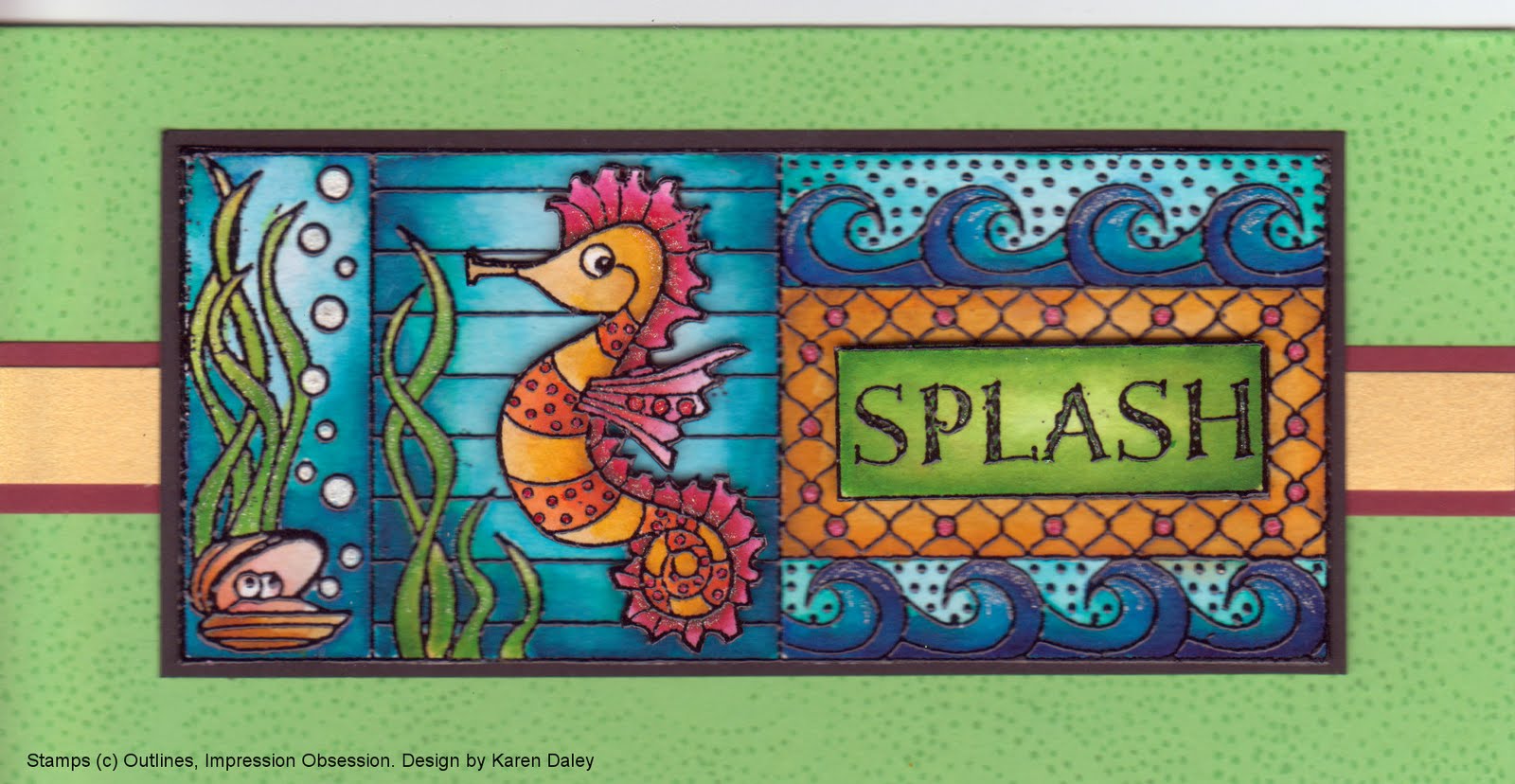
faux batik featuring mulberry paper. That will be a trip down memory lane - it was the first class I ever taught at Heather's! I've re-vamped that sample though to showcase the new stamps from the summer line and a great bamboo stamp from Hero Arts. Also, the faux batik class will give a brief introduction to watercolouring with Tombow markers if you are interested in trying that out. While I'm shamelessly plugging my classes, I have another one running tomorrow morning, with a couple of masculine cards suitable for Father's Day.


Thanks for dropping by! It's Friday tomorrow! Yay! Fun Friday is always a hit at our house. Its DD2's turn to choose the movie, so probably Tangled would be a safe bet. It was DD2's concert at Kindergarten this afternoon - so cute! I loved it. Her teacher is amazing. It was also a good opportunity to connect with some of the parents and talk about summer playdates. I'd like her to be able to keep in touch with these new friends over the summer.


Well, it's one minute to midnight so I'm going to sign off and thank you for your patience during my dry spell. Looks like you were right, Nimmy, my mojo came back with a bang! Thanks, all, for the encouragement :-)

Friday 10 June 2011

Less is More - Monochromatic


Here's my entry for this week's Less is More challenge, theme Monochrome cards. I had a few minutes to spare before work and heard my stamps calling me. I inked up a new one by Crafty Individuals with Vintage Sepia versafine ink. (This is my consolation prize stamp that I awarded myself for not winning the monthly blog challenge over there. I picked myself to get the runner-up prize of the CI stamp of my choice. I picked this one. I can see myself "winning" a lot more runner-up prizes like this in the future. And the best thing is they don't need to come out of my stamp budget because they are prizes. Sort of like you don't have to pay tax on lottery winnings. I can't believe I didn't discover this loophole sooner!)

Edited to add: Please note I didn't win anything from Crafty Individuals. The winning projects were lovely and I merely concocted this scheme as a way of buying myself more stamps without having to include it in the stamping budget. Under this level of close scrutiny, the logic, which was flimsy at best, seems to break down. From now on, I won't consider these stamp purchases as "prizes", but as "groceries" instead.


Back to the card. Inked and stamped with sepia on a caramel card base and added a frame of sketchy lines and a Scor-It line on top and underneath. This card seemed like a good masculine card, so I added a "Happy Father's Day" (A Muse) under the image. I felt it needed something more, so I added some highlights with my white Bruynzeel pencil crayon. Those things blend like butter. They go on really smoothly and I'm usually able to coax any harshness out with my fingertip and I still had time to upload. It's an early attempt at Less is More, since I'm usually of the school that more is more, if not of the school of layering something on to conceal a mistake. No room for cover-ups here! I'm going to try more of these challenges. It's a big stretch, but that's what makes it fun.


Also, just wanted to say thank you so much for your lovely comments of encouragement. I think my mojo is coming back thanks to that! I can't say how much it meant.

Sunday 5 June 2011

Scrap Sunday 12


Well, my mojo is still missing. I can usually find it foraging in my scrap stash, but today I was only able to come up with this. The flower is a scrap (grungeboard, Tim Holtz die, Judikins mica gloss) that's been on my desk for a while. It had the button on it already, from its near miss on another project. The card base is another scrap, with a dragonfly cover-a-card background stamp (Impression Obsession). The sentiment (Stampin' Up) is on kraft paper with some black glaze pen written over it and a portion of it in red, slavishly bowing to the rule of 3 for the red. I think the kraft piece is too big, or the sentiment too small. There is also a background stamp of dotted swirls (Impress Rubber Stamps), stamped in Lake Mist on the kraft. On the upside, my five year old really liked it, but turquoise is her favourite colour, so I could be accused of playing to the gallery there.


In other news, I got my two days of all-colouring-all-day at Heather's Stamping Haven. It's that magical time of year when Krista Schneider comes up and teaches colouring techniques with Copics and Tombow markers. We made 17 projects in two days. She does all the assembly and stamping and we do the colouring. I didn't quite finish yesterday - hit the wall at about 4:30. Still, it was a great time and nice to catch up with friends who share a common interest. The only downside is that it's hard to come crashing back to earth. Still, it's better to have stamped and lost than never to have stamped at all. Isn't that how the saying goes???? Hope you've had a good weekend too.