Sunday 31 October 2010

Winter Scene


I made this card for Penny Black's Octoberfest contest using Christmas stamps from this season's new releases. I stamped the snowy scene in Versafine on whisper white cardstock, and matted on navy. The trick there was to put double tack adhesive over top of the whole thing and apply cool highlights ultrafine glitter (Glitter Ritz) to the panel. The shimmer has to be seen to be believed. The sentiment is stamped on shimmer paper. The cardbase is white linen, with a Penny Black botanical stamped in Brilliance platinum. The whole effect is very cool and shimmery and if it's a random draw, I have a good chance. Otherwise, the comptetion is very stiff. There are tons of great entries in the contest.

Happy stamping!

Happy Hallowe'en


Happy Hallowe'en! We've had a great day. I was at an all-day Copic class with Krista Schneider. It was wonderful. Colouring alllll day - what could be better??? Well, going over to my brother's place for a super Hallowe'en party and then coming home to make a Gothic arch. That's a lot of goodness packed into one day. I'm so worn out from all that goodness I can hardly picture going to work tomorrow!
This arch was a fun one. I went with a pre-coloured piece of watercolour paper that I had around from a session of spray and smoosh on the freezer. I had used shades of green and blue from Adirondack colour washes and let them dry. I think Pesto, Mushroom, Stream, and Denim were implicated in this recent experiment. I stamped on the spooky branches and text (Tim Holtz - Stampers Anonymous) in distress ink, followed by the crow and pumpkin image (Inkadinkado) in Ranger Archival. To colour them, I painted on bleach over the moon, crow and pumpkins. Then, I added colour back in with a paintbrush and distress ink pads (mustard seed, spiced marmalade, rusty hinge, walnut stain). Then, swooped over the focal image with Rock Candy crackle paint, which did smear the moon somewhat (that would put the trick in trick-or-treat I guess). Waited impatiently for cracks to form then bam-whooshed it with the heat tool to finish it off. Then it needed something more, so more spooky branches stamped on and embossed with Bavarian Bronze to create some depth of field, or something anyway. So that's my Arch #21 - Spooky theme for Inkurable Stampers! Yay - in under the wire on Hallowe'en.

Wednesday 27 October 2010

Bellarific Friday


Here's a card I made for Stamping Bella's Bellarific Friday, which is a sketch challenge (all stamps Stamping Bella). I like this cute owl image, with his plaid wings and polka dot tummy. I chose the patterned paper first (Blush, BasicGrey) to get my colour scheme. I used Tombows to colour the owl and mounted him on a scalloped circle (Nestabilities for both cuts). This is a 5 1/4" square card, and the red mat is metallic paper.

I'm not sure what occasion will call for a plaid/polka dot owl card, but doubtless I will recognize it when it comes up. Maybe I'll donate this to the church bazaar and someone will pick it up as the perfect card for someone heading off to an ornithologists' golf tournament. Niche market to be sure, but I would imagine that people have a hard time finding that perfect card for the owl fanciers in their lives.

Thanks for looking!


Friday 22 October 2010

Arch #17 - Metals


Now this is metal, baby! I started with a piece of copper coloured foil (Spellbinders, I think), coloured it with alcohol inks (Terra Cotta, Denim, Espresso, Copper) and ran it through the Big Shot with a Tim Holtz folder (Retro Circles). Then I had it on my desk for two days while I fiddled and snipped and tried to find things that would look good with it. Not sure I succeeded there, but I will say that this was the best of a bad lot. This guitar dude (Stampin' Up!) seemed to trigger the music kind of metal for me (though his hair is too short and styled and pants a bit too stylish to be a real metal dude). Still, it's evokes the idea if not actually slaving to reality. I stamped him and embossed him with Lapis Lazuli on a piece of colourwashed paper I had on hand. That got scuffled on the edges, stamped with a word stamp (Tim Holtz, Stampers Anonymous) and mounted over some navy mulberry paper with stars. The "heavy metal" is from my label maker and at this point I called it quits. In real life the metal is very shiny and I spent the whole time making this freaking myself out seeing my reflection moving in all those retro circles. You know how movement can catch the corner of your eye, well this foil is extremely reflective. Add numerous ridges = more reflective surfaces, plus one over caffeinated stamper and you have one jumpy situation. And here I thought stamping was supposed to be relaxing!


Thanks for stopping by.

Arch #16 Birds


Ok, this arch (#16, Birds, for Inkurable Stampers) was a bit of a stretch for me. I wanted to do something a bit different, softer colours, more stamps, less 'stuff'. I assembled the various bird stamps from my collection of Sunshine Designs stamps (The Stamp Barn), as well as twiggy branchy bits, and some general design elements. I chose 3 colours of Distress ink, got out the sticky notes, and went to work. (Or should I say play!) The colours are Victorian Velvet, Stormy Sky and Peeled Paint. (I'm not positive on the green - I made this about a week ago.) I stamped, I sponged, I coloured (with Copic/Promarker) and highlighted with glitter pen and pearl paint. I also emphasized the borders between the areas with a black marker. In the end I decided I liked it enough to post, but I'm not in love with it. Still, it met the criterion to have fun trying something new, that was a bit of a stretch for me. (Except for the crooked "Happy" - that's my signature style!) I had the dickens of a time finding a word stamp for that panel. I guess that's where a bit of planning would have come in handy. Now that would be a real stretch for me!


Thanks for stopping by!


Arch 15 Keys or "Escutcheon Subdued"


Introducing the escutcheon formerly known as recalcitrant. This escutcheon caused me no end of grief, but I was able to subdue it in the end, only to discover that it looks like plop when I scanned it. I'll try to take a picture of it instead if it's sunny tomorrow since Arch #18 needs to be photo'd too. Anyway, this escutcheon was painted, sanded, painted another colour, distressed, embossed and painted again. Man, that grungeboard can take a lickin'. It practically had 40 lashes and it looks like the day it was born, or at least popped out of the hardware panel. I think in the end, it's mostly black, with some pearl and silver paint over top, highlighted with some blue, green and red twinklings that were out for another project. I backed the keyhole with some dark paper so it wouldn't peek through to the verdigris metallic panel, which I embossed with the Wrought Iron folder. The arch itself is a sort of greenish navy, with a delicate stripe. I stamped it with the Hero Arts weedy frame using a gold metallic, Peacock Gold, I think. I also stamped a weedy looking flower (Stampin' Up!) in brown on the side. The key is from my stash and the ribbon is BasicGrey (Periphery line I think), tied with hemp twine. All in all, this arch isn't what I had in mind, but it was good enough. I feel like it needs some words on it somewhere, but you know what, it was time to stop.
Thanks for stopping by!
PS Did you see how I pinned down that escutcheon? He's going nowhere now. I win! Also I suppose I should mention that this is for the Inkurable Stampers Gothic Arch challenge, but this would be the 15th time mentioning and you're probably catching on....

Sunday 17 October 2010

Glowing Colour Wash


No scrap card today. I had to work most of the day, then tried to spend some time excavating my stamp desk. I did manage to clear a path towards it, so that's a start. I'll post one I made Saturday night instead.
This card features a brand new Penny Black stamp (yum!!!!), well new to me. Also new Adirondack Color Wash sprays. Double yum!!!

I got some new sprays recently and wanted to try them out. I covered the top of my deep freeze with packing paper, but an old towel would do. Then I spritzed a bit of paper (about 1/4 sheet, just grabbed a couple of plain whatevers from beside the cutter) with water, then some Adirondack color wash (wild plum, butterscotch, cranberry) and smooshed another piece of paper over top. Peel gently apart and wait to dry. You could do that, or you could rush over to your heat tool and dry them off to see how they're going to turn out. That's what I did. They will curl up, but they flatten out again. You can always iron them to flatten them out. (Which is what irons are for, right?) Once I had my piece dried off, I stamped a new Penny Black (Carefree Smiles!) repeatedly in black pigment ink and embossed in black. Matted on some black paper and then spent ages trying to find a paper to mount it on. The washes are so vibrant that they can really suck the life out of the background cardstock. I settled on this delicious tsumugi. It's richly pigmented so can stand up to the wash. I couldn't find an accent piece, so I trimmed the butterscotch bit off the end of another washed piece. A bit hard to do, since that piece was scrumptious, but if I am going to enjoy these washes, I need to get used to using the paper. That bit of butterscotch behind really adds a nice accent. I added the message stamp at the bottom (Sunshine Designs - The Stamp Barn) and some black accents (Ranger). Then today I added some white accent lines with gel pens and realized that however much I might want to be Michelle Zindorf, Queen of White Gel Pen Accents, I am not Michelle Zindorf, QWGPA. Still, my daughter liked it better with the gel pen accents, and I think I do too. It's always hard to know when to stop, especially with irreversible things like liquid accents and gel pen.
I am in love with these washes! They just glow. I am going to experiment with some resists next. Good times!

Tuesday 12 October 2010

October Challenge at Inkurable Stampers


So, do you find yourself blinking and rubbing your eyes? I am. I wanted to do the October challenge for Inkurable Stampers (sketch with three stamps) before October whizzes past me. I saw this technique in a stamp magazine and the way that other person did it, it looked very cool. This looks not so much cool as out of focus. What you do is ink and spritz a solid stamp, then repeat with another colour. I used Deep Turquoise and Van Dyke Brown (Nick Bantock line). I like the turquoise and brown combination, which I accented with the colour base (a greenish navy) and the textured paper in shades of brown. I also stamped a sketchy flower (SU) and the message (SU) for my three stamps. The ribbon is a better colour match in real life, and it's a bi-colour silk ribbon from my stash that I believe I got from Stamp and Scrap Canada. They have some cool collagey things, but lots of stuff is out of stock since I think they are trying to sell stuff off. Still, every time I go there, they are still in business and I always find some treasures.
Well, I'm not sure how happy I am with this project, but it was fun to try out a new technique. It might just need a bit of work to get it right. The stamp that the other person used was more solid, which lent itself better to the purpose I think. Anyway, it is what it is. And it freaks me out every time I look at it, like I'm losing my vision or something. I'm losing something anyway, may not be my vision, but I am definitely losing it!
Thanks for stopping by!

Monday 11 October 2010

Scrap Stash Sunday 7


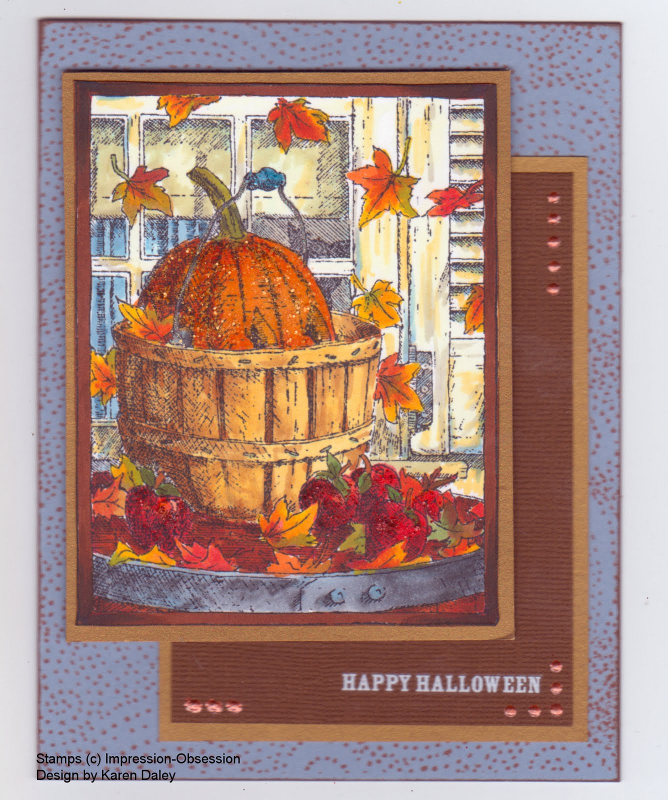
Hello! Happy Thanksgiving! So much to be thankful for, including a few stolen moments this morning to make this card. I guess that would make it technically Scrap Stash Monday, but on a subjective scale, this feels like Sunday (minus church). Plus, it's my blog and I can do whatever I want. Ha!
This lovely partridge in a pear tree (Old Island Stamp Company) is embossed in gold on black paper, and was an orphan from another project. (They prefer to be called orphans, rather than rejects.) He is much happier now that he has been adopted by this project. There was a waifly stray piece of gold paper, no trimming required, immediately under my left hand on the table, so that was pressed into service as well. The music piece was floating at the top of a pile, and seemed like a great backdrop. I'll pretend it's the music for "The Twelve Days of Christmas". It had been stamped (Tim Holtz - Stampers Anonymous) and sponged with various shades of Distress Inks. The card base is a gray-green tsumugi, and had been cut and scored and orphaned during another project. I stamped it with khaki versacolour using a solid pear (Heather's Stamping Haven) and the sentiment is Cornish Heritage Farms (RIP) in India Ink (Memories). I like this card - quite non-traditional colours, but very soothing and still festive in an understated way. I guess the enormous, flashy gold piece in the middle isn't exactly understated, but it's my blog HA!
NSR. We had a lovely Thanksgiving. My brother and his family came over yesterday afternoon and hubby cooked a fabulous turkey. Yum yum. Mt Scio savory in the stuffing, as always (if you've had it once, you'll never want another kind). My sister-in-law brought her signature mashed potatoes and sweet potatoes in halved orange cups. I made pear salad, an import to our family tradition from my aunt's in-laws. Truly Ruly Punkin Pie from my paternal grandmother's recipe (though I wimped out on the pastry and used bought, not nearly as good, but worth it not to have lost my mind in the pie making process). The kids were sooo good and had a great time together. They even organized a Halloween dance party in the living room in their Halloween costumes. Nephew had his robot/spaceman costume and did an impromptu robot dance, complete with deadpan face. It was amazing. Niecelet and nephew stayed over so the grown ups could visit and play cards till the wee hours. It was awesome. Two things wrench me from my state of self-satisfaction (three if you count the pastry).
1. DD2 has asked approximately 17 times if we can have Kraft Dinner for our next big festive meal (Christmas). Yes, Kraft Dinner, that wonderful boxed variety, that claims to have real cheese in it. Yep. That's my girl. The local turkey impeccably roasted and home made Port and Pear Cranberry Sauce are apparently a little 2009 for her I guess....
2. DD1 and Niece (best friends since Day 1) made star badges for DD2 and Nephew that say "Great Job!". These were awarded for staying away from the big kids. My SIL and I had a big discussion about whether this was a very resourceful and inventive way to have all parties happy with the state of affairs (jr cousins wore their badges proudly all night) or whether it was quite a horror. By the cold light of day, I still haven't made up my mind.

Saturday 9 October 2010

Stampotique Vintage Challenge


Here's my card for the Stampotique Vintage Challenge. I was hoping my stamp order would get here in time, and lo! it was waiting for me today at the door. It was so exciting to tear into the package and see the new goodies. I've used most of them here (two lovelies didn't get inked up today, but they will soon). My inspiration for vintage here is the floral print on the girl's dress (seems like a very vintage print), the words clipped from a vintage book, and the chaste scene of new love blossoming 'neath a mushroom.
I found the background paper on my desk (more vintage??? hahaha), leftover from a spray and spritz experiment. I think I used Adirondack colour wash sprays (butterscotch, eggplant and espresso), but I can't quite remember. I think I also had some distress reinker and water in there too, as well as some Perfect Pearls, since in real life this has a lustre and shimmer. I also accented it with a bit of sequin waste and Antique Linen ink. The Giant Shroom, rocks, grass, and swirl plants were stamped on in India Ink, and accented with pencil crayons. The little ones, not sure whether I've decided they're faeries, goblins, wee folk, or what, are both stamped with the Gog Lin stamp and paper pieced for clothing. For the girl, I trimmed away her collar and hat, making some hair out of two hats instead. I also extended her tunic into a dress. The crown also gave her something different for her head. A few eyelashes turned her into a girl. Then, for the element that really made me love this card, the words. I don't have any Stampotique word stamps (yet!) and this challenge is Stampotique-only. So I turned to my trusty, dour vintage novel (The White Oaks of Jalna) and sure enough, the morose hero had an unrequited love scene towards the end of the book and I was able to cobble together this little description of the scene, which for me ties it all together. This card also made DH laugh, since "inward brightness" is just not at all the expected description of this little one. Anyway, I love these images, I love the giant shroom and these little characters.
I just googled this novel that I'm merrily redistributing, tiny piece by tiny piece, and it turns out it's by a Canadian author, an Ontario one no less. It was turned into a miniseries, the most expensive one in Canadian television history. Apparently it cost over $2000 to make. [I added that bit - we Canadians like to poke fun at ourselves. Sorry. Oops did it again! hahaha!]
Thanks for stopping by!

Wednesday 6 October 2010

Folk Tree


Here's what I coloured in last night when we were watching TV (rented Wall Street for some 80's memories, thought I don't think I saw it at the time). The image is Artful Stamper, a new image by Krista Schneider. I saw it on her website in the new illustrations and fell in love with it and a few others which I hope to ink very soon. I stamped this on some Neenah crest I think, using Memento black ink. This image is perfect for Copics - nice detail, but the spaces aren't too tiny for those big tips to work in. (I only have the brush/chisel tips, only one of the tiny tip.) I went with a rustic colour palette of red, yellow, green and blue. I went for a quick and easy base: Cherry Cobbler, Garden Green stamped with chalk ink using a Cornish Heritage Farm backgrounder, and a scrap of Pacific Point. All piecses were inked with Memories Art Print Brown. I used stickles to accent (Tiara, yellow, Xmas Red, Crystal) and a PTI button with crochet cotton. I debated the button with hubby, who felt it was unnecessary and distracted from the card. I told him if I wanted is opinion, I would give it to him. He settled on deciding that looking at the button made the tippy tree less noticeable. I told him it was meant to be like that, "It's a folk tree." He just asked where they guy wires were. Sigh. [On the upside, I know what Christmas card I am going to make for him! bwahahahahahah]
Thanks for stopping by!

Saturday 2 October 2010

Peeking Pumpkin


I made this card for an upcoming Impression-Obsession challenge, which is a colour challenge: coffee, pumpkin and nutmeg. I stamped the image (Peeking Pumpkin, H1792) in Memento black on Neenah white paper and coloured with Copic markers. It's been a while since I've had them out, so it was fun get reacquainted. This is a fun image to colour - all those leaves and details. I have another one stamped off that I want to try in pencil crayon. The pumpkin is accented with Spiced Marmalade distress stickles, the apples with Fired Brick, and the handle with Broken China. The card base is Bordering Blue (one of my favourite SU colours, now retired, and stockpiled in my cupboard). I stamped it with an I-O background (Fluff) in Palette ink (Burnt Sienna) for the nutmeg element. There is some dark brown in the border for the coffee element, and of course there is a pumpkin. I had meant to incorporate Early Espresso paper, but it didn't work out. I suppose the Bazzill paper that has the Happy Hallowe'en rub-on is the colour of instant coffee grounds. Whether those count as coffee is a debate for another blog. The final accent was some terra cotta dimensional pearls. Heather just got in some Viva Decor Pens, which are similar to dimensional pearls and I got a colour to try out. They seem more robust than the pearls, which tend to get squashed, no matter how long they dry.
Well, it's long past bedtime, so I should toddle off. Morning will come soon enough and I'll need to dream up breakfast for three kiddies before I swan off to a stamping class. I'm taking a neat looking one where we'll be playing with the metal stuff and all those tools from Ten Seconds Studio. It's going to be fun! I won't have my zombie class in the afternoon. Sadly, my gamble went bust - turns out there are not droves of stampers in town dying to turn Magnolia into a zombie. Oh well, it meant I could make this tonight instead of prepping for class so there's a pumpkin lining to that cloud!
I will be doing a class on Nov 6th, a gothic arch triptych Christmas card, which features exactly zero Magnolias and zero zombies.
Thanks for stopping by!