Wednesday 18 November 2009

Partridge in a Bare Tree


Here's a Christmas card I finished up tonight. I've been plugging away at my Christmas cards. At this rate, I will be done in good time for Easter!
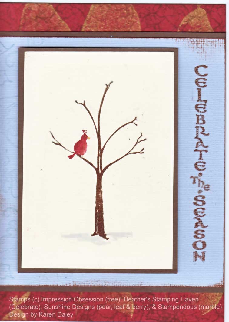
I fell in love with this image when I saw it at my LSS and I inked the tree with a dark brown marker and added colour to the bird with a couple of shades of twinkling h20 so it has a lovely shimmer. I added a tiny dot of marker for an eye, and swishled in some grey at the bottom to ground the image. I didn't know what to do with it, but I really loved the white space (actually off-white space) and it sat on my desk for a while, long enough to get a bit of an aged look and some smudges on the nice off-white space (sigh). Still, the smudges aren't fatal to the overall look, and tonight I decided it was time to make it into a card. I won't describe all the dead-ends, other than mention I have a fantastic border made of Glitter-ritz and pears. It's gorgeous, but didn't fit here. It will get turned into something lovely. I am totally enamoured with my new Glitter-ritz glitter! I also have a bunch of SU glitter, so I am going to see if it works with similar techniques because I know my club ladies would love that!
Anyway, back to this card. I spend quite a lot of time on the red background, and was a little dismayed that it is almost all covered up, but am coming to terms with it. I started by stamping the solid pear in gold on chili cardstock, heat set, then felt it needed some texture so I pulled out my marble effect cube. Boy is that thing ever cool! It is going to be my new go-to stamp for a nondescript texture background. I used artprint brown and soft suede for the stamping. Then I dithered for quite some time on the middle layer. I had a sheet of the perfect colour of Bazzill, but it's my last one and I don't know what colour it is and it is the perfect colour for every single card I am making (probably the reason it is my last one) and I couldn't bear to cut into it. That's when I discovered that the bluey-grey piece was, in fact, even more perfect. I dithered another while on what size and shape to make it and the stamping force drew me to my Christmas stamp drawer and this greeting leaped into my hand and it really worked. That layer needed a bit of something so I stamped the leaf & berry down one side in a medium blue chalk ink (Aegean blue). The greeting is stamped in chocolate chip craft ink and embossed with chocolate brown ep. I think chestnut ep would have been really good too, but my LSS was closed this evening so I couldn't do an emergency embossing powder run. You may be admiring the grunge effect I achieved on the greeting. It's very subtle, but not hard to do. First, ink your stamp with craft ink, and stamp. Realize you didn't ink/press hard enough and there is no way on God's green earth that the embossing powder will stick to that feeble attempt. Consider the folly of trying to re-position, but figure, what have you got to lose - it's not working as it is. Carefully reposition stamp and press harder this time, intently channeling the universe's stamping force. Lift away and presto, only misaligned on the bottom. Looks like something you'd pay money for in the grunge stamp aisle, so emboss it anyway. This is why I like edging everything in Artprint Brown - it gives that grungy distressed look to everything that disguises smudges on vanilla and ghosty greetings. It all looks like it was meant to be there.
Then I toyed for a long time with a vanilla taffeta ribbon and I eventually tied the perfect bow. I was very pleased with myself. The bow looked fantastic, but when I lifted my head up away from where I was hunched in obsessive concentration, I realized the bow looked terrible on the card and ruined the whole effect of the simplicity of the bird. Off it went. I am going to have to go to ribbon university. Or sell all my ribbon. Maybe sell all my ribbon to pay for ribbon university. Hmm.
So that's this card! I really like it. I think what I like is the interesting and very textural bottom layer, the medium amount of texture on the middle layer and the very simple top layer. I should add that there is a subtle linen texture to the vanilla paper that really adds a lot of interest. And in real life the shimmery bird draws your eye right in.
I love stamping. It's been a long week at work (is it only Wednesday???) where I've been dealing with one thing an another, with only logistic regression analyses to cheer me up between the one things and the anothers. So these evenings of stamping with my radio tuned to Studio 93 (awesome 80s new wave and the fabulous DJ Vinnie White of the Whites of Brighton) are intensely and gratifyingly therapeutic.
Now I must figure out what that sheet of Bazzill is so I can re-stock. It's sort of reddish brown, but it looks like it's two-tone red with brown flecks. It's not a solid colour. It came in a darks multipack if anyone has any suggestions.
Thanks for stopping by! And if you are reading to this point, well done! Reward yourself with a trip to the Quietfire Designs blog hop if you like beautiful calligraphy and stamps!

Wednesday 11 November 2009

Something fishy


A while back I went on a real background binge. I pounced and blended and dripped and splatted my alcohol inks all over the place. It's so much fun! But there are only so many sheets of glossy paper that can be tinkered with before I have to put them to a good use. I turned this one into an all-purpose card, which I actually recently used. (My cards have better odds of being hoarded than being given away, and I am always trying to fight this tendency, but it's hard.) I was off to a stamping play date at a friend's house (check out her awesome blog - she is one talented lady, and so so nice) and she just moved so I needed a housewarming card. A couple of fish was as close to housewarming as I had in my stash. (I know I have previously said that fish are for masculine cards, but I will also decide that they are excellent for housewarming, and if I search the internet hard enough, I might find that they are an ancient symbol for hospitality. After all, isn't there some saying about houseguests and fish????)
I was also fixated on finishing my velvet poinsettia Christmas cards that day. (Which I did finish, but the end result was that I only have fish cards for a housewarming. I love making fish cards, but there doesn't seem to be a good occasion for giving them. I'll have to hold out for April 1st, which has some sort of fish connection for the French. Now there's a reason to head off to Wikipedia, but I will try to finish this post first.)
Well, I did dash off to my friend's, we had a great night and even got some stamping in. We had a new order to play with and I made a cute holly card with button berry accents. So much fun!
Thanks for stopping by.


Anyway, I did the polished stone background with various alcohol inks on glossy paper. As I'm peering at it in the dim light, I see some vaguely flower shapes and I now recall that I had made a bunch of pieces of floral background stamped on glossy in Versafine dark blue. I didn't like them, so I thought I would try to enhance them with alcohol ink. It mostly covers them up, which considering I didn't like it in the first place is an enhancement. If I had been trying to keep it, I might be more annoyed. I should try to remember this for future reference. I had these fun peel-off stickers and I whapped those down, added some dewdrops and matting and I had my main panel. I put it on a textured base (C'bug folder with sticks, meant to evoke seaweed). A hairy bit of yarn finished it off. I like the colours and the various textures, etc. The alcohol backgrounds are just so pretty and interesting. I could just play all day!


Thanks for stopping by.


Tuesday 10 November 2009

What's Cookin'


Wow - there's nothing like a scanner to pick up all the flaws in a watercoloured image! My watercolouring usually passes the "can you see it from the highway?" test, but clearly doesn't pass muster for the scanner. My excuse (and I will stick to it) is that all the nicest versions of the card went off to 8 little girls as this batch of cards was invitations to my daughter's birthday party. We're having a make-your-own pizza party at a local grocery store that does these sorts of things. It's our first "outside" party, and I am really looking forward to it.


I love this stove stamp, and I must confess that when I saw this post, I was smitten! We used to have an avocado stove, but I don't recall that it was quite as jaunty as this one. But perhaps that's only because it didn't have funky chunky radishes to back it up. I love those Offbeat little veggies - the perfect retro touch to my stove.


I got this stamp originally to go with the sentiment "I hear there's a bun in the oven", but the guy's wife just had the baby so I have missed the boat on that one. Must now make baby card, instead, maybe will try another lambie effort.


Anyway, this card was fun to pull together and I used an apple stamp with this neat ink I have that is gold interference ink. It's very cool. I used it to stamp "yum!" inside too, along with all the details for the party.


Thanks for stopping by!

Lamb baby card


A friend of mine from university recently (well, not that recently, but it still feels recent to me) had a baby boy. This is very exciting news and I wanted to send a card and my well-wishes. I don't have a lot of baby stamps because it seemed like all my friends were done having babies. But they aren't, so I had to expand my repertoire of suitable images (more stamps - poor me!). I found this one at my LSS and it has a coordinating word-y image, which I used on the navy background.
I cased the sketch from Krista's summer class (the peapod one) and turned it portrait instead of horizontal. Really this card started out with the alcohol ink polished stone panel and I had a vision of that as the starting point, with soft blues and a dreamy quality. Then I had to colour this little lambie to match (used markers and paintbrush), and then took forrrrr-evvvverrrrr (said with all the dramatic emphasis I can muster) to find some matching blue cardstock to bring it all together. There were some tense moments at the last minute that it all wouldn't fit until my mother, who was visiting, suggested I turn the critical piece 90 degrees and whew! it all came together. (Have I mentioned that I have very poor spatial skills???) Anyway, thanks to my spatially gifted mother, this card all came together. I almost ruined it by over-stickling the sheep, but did you know that you can scrape most of the stickles off once they have dried. In the absence of a carding comb, it is a good way to remove excess glitter from a fleece.
Now I just need to get this and the present in the mail!
Thanks for stopping by!

Thursday 5 November 2009

Heartfelt wishes


Our wonderful office admin assistant has left for greener pastures and Friday wa her last day. She's a wonderful lady, one of those people who just brightens your day, so I wanted to make her a special card. There was a group card circulating somewhere, but I thought another one wouldn't hurt the matter (and I never did see the group one so I'm glad I made this one!).

I totally ripped off the layout from one we did at last year's Christmas class with Krista Schneider (it was the piggy one). However, I did chang up the image and the colour scheme to this. I have had a big crush on the Indian Summer collection and have been dying to use it, and this seemed like the perfect occasion. I cuddled up with Jean and Lionel on the telly (those reruns of As Time Goes By just never get old!) and had some happy times colouring. This came together really quickly since I was using patterned paper and a pre-designed layout. When I'm trying to match marker to paper, I do test swatches on a scrap of watercolour paper. I usually have little scraps like that to hand since I can't throw them out because they will come in handy. (However, I ruthlessly throw out any piece smaller than 1/2" square. One does need to keep the tide of scraps at bay after all.)

The sentiment is a SU rub on since I didn't have an appropriate stamp of the right length (gasp! it's true!). (My stamp collection is quite varied and I usually can find something, but I didn't have a sentiment suitable for a farewell that was between 1 1/2 and 2" long and no more than 1/2" high.) This is just the sort of papercrafting emergency I foresaw when I ordered the Chit Chat rub ons, and they did indeed save the day.

Thanks for stopping by.

Supplies: email me if you're interested. Rub-on: SU (chit chat) and bravo burgundy cardstock (plain and textured).