Tuesday 23 March 2010

Hoo Loves You?


I just couldn't resist these stamps last week when I was in my LSS. They had gotten some new A Muse stamps in and I couldn't help but think that if I got these new ones I would be able to make cards like Julie Ebersole. [Like that could ever happen! Still, it can't hurt to try, right???]
I stamped these images in black India Ink and coloured them with Prismacolor pencil crayons, blended with odourless mineral spirits and a blending stump. I would love to know how to do this better. The colouring is ok (other than under the lidless eye of Sauron the Scanner), but I really don't know what to do with the stumps. I have been cleaning them between colours on this soft sanding block I have, but it seems to be softening the tips so they are getting feathery. I may try to get some sandpaper and see if that works. I feel like there is this whole body of stump lore out there that I am just unaware of. Kind of like those contestants on Amazing Race this week (two pairs of them!!!!) who didn't know who Joan of Arc was and thought he (!!!!) was the one who ferried animals around (!!!!!). I am still shaking my head.

Anyway, if anybody reading this has any stump lore they would like to share with me, or a link to a great blog with tips/instructions/secrets of the stump coven, I would really appreciate it.

More about this card: the white paper is SU's whisper white, and it's matted on basic black. The card base is soft suede, the buttons are PTI, the thread is crochet cotton, and the patterned paper is BasicGrey, Granola line, which I love. So funky!!! I loved how the big circles evoked those dear little owl eyes. And I love that owl on the branch making eyes at the other owl. And I just love the boy owl's expression, so charmingly stunned. (You probably noticed I used the classical Greek technique of colouring the male darker and the female lighter. Sauron the Scanner didn't really pick it up as well as I would have liked.) I wonder if I am brave enough to ink in a little heart between the two owls. It could ruin the whole thing, which, being glued together with Tombow Mono Multi, could never be pried apart. I think I will go for it.
------- (mentally sing the final Jeopardy jingle to yourself if you wish) --------------------
I'm back now, and have added some hearts and am entirely too pleased with myself. What do you think? Is it better with hearts? I channeled Her Royal Rubberness and inked them in. (Julie HRR often adds her own sentiments, pictures, etc. and is a wizard with the Micron. I am not even a wizard's apprentice, but I am pleased with these hearts!)

I think I will try to find a way to sneak this into DH's coat pocket or something so he will find it unsuspectingly. I did show him an early stage of colouring, but I don't think he'll remember. And he said his aversion to ribbon is wearing down, so the little brown felt tab (SU) shouldn't be too overwhelming for him. I was originally going to make this for my daughter's lunch box, but it's a bit sombre for a little girl. I think I will make a sunnier version for her. But that will be another day's project.
Thanks for stopping by!

Monday 22 March 2010

Faux-toshop Fuchsia


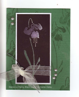
Here is my first attempt at Cathie Allan's technique "photoshop without the computer". (Hence the really dreadful pun in my blog title. I would apologize but I'm not really that sorry.)

You can see the instructional three-part video, starting here. The technique relies on a great new stamp positioning device called Cathie Allan's Position-It. I took a class recently at my LSS, taught by Sharon Stead of The Stamp Barn and we made some really great projects. I was inspired to go home and try out this new tool to see if it lives up to the billing. In my opinion, it really does. I stamped at least a dozen times on that fuchsia, if not more, and it was perfect every time. If you are moving things around, it's a bit trickier to get that exact alignment, but when you want perfect layers, it is definitely achievable.

The basic premise of this technique is to stamp on black with pigment ink, starting with white and then adding colour, building up the layers. I used shades of pink and purple for the fuchsia (Chandelier by Penny Black) and green for the stem and leaves. I added a hint of silver at the end, which really made it pop. I loved this technique and I will be trying it again very soon. It is quite easy and lots of fun. It's best for big solid image stamps, unless you have the patience to repeat the same steps over and over for tiny stamps.

The layout is one of my usual layouts. I tried to go all fancy and interesting and it was really quite hideous. It turns out that taking a colour you don't like and adding other colours you don't like in papers you are trying to use up will result in a card with no redeeming features. It also turns out that Tombow Mono Multi cannot be pried apart (and I am the queen of prying apart disastrous layers). The only good part was I wound up tearing one of the ugly papers into tinier and tinier pieces that it was unsalvageable. (And I'm not talking a fit of pique either, this was artful tearing for accent purposes.) Anyway, I went with simple here, and instead of adding liquid dimensional pearls, I used little sticker pearls (Hero Arts), which have the advantage of being uniform in size and easy to position where you want them. They do seem to misbehave when no one is looking and rearrange themselves on the scanner. You can easily move them back and rescan and upload, or not. You could also fix it with digital wizardry in photoshop, but I don't hold with all that pagan claptrap, have sworn off it for Lent in fact. And it would verge on blasphemous to start photoshopping (is that even a verb?) a "photoshop without the computer" card.

So you could consider this a quick and easy card, with only one stamp and a couple of layers (and a bow! I forced myself to leave it on!) and only dozens of colours of pigment ink. Turns out I'm missing fuchsia pink - guess I'll have to go back to my LSS at some point ;-)

PS I now know how to spell fuchsia. In a devastating blow, I was defeated at gnilleps playing Cranium with my family, misspelling fuchsia backwards. Actually I would have gotten it wrong forwards too. But now I have added the spelling of that flower to my repertoire of words I can spell with confadence.

Thanks for stopping by!

PS Other supplies used not mentioned above: watermark (Top Boss), color box pigment and fluid chalk ink in far too many colours to remember, green tsumugi paper, brushed silver paper, Basic Black paper (Stampin Up), Offray ribbon, Stampin' Up silver cord.

Saturday 20 March 2010

Evening with Shelli


A local Stampin' Up demonstrator, Kim Assaly, recently won a Workshop of a Lifetime with Shelli Gardner, co-founder and CEO of Stampin' Up. You can get the full details about that on Kim's blog. As part of her prize, Kim was kind enough to host a demonstrator evening with Shelli. There are more details and pictures on Kim's and Shelli's blogs.

I went to this event out in Hawkesbury, and had a such a great time. I even got to meet Shelli and get my picture taken with her and her daughter, Sara. Shelli is so warm and sincere and it was a real pleasure to hear her speak that evening. Very inspiring! Poor Shelli and Sara had their luggage go astray, so that's why they were wearing hats. How they managed to look so put-together and stylish anyway, I will never know! It was a great evening and I got some great swaps and make-and-takes. It was a wonderful time, and a great way to close the circle on my demonstratorship. I will be letting that lapse in order to make more time for what's most important to me - my family. I will still be stamping, and teaching at Heather's, and I really want to keep up with all the wonderful people I've met through Stampin' Up. This is definitely bittersweet for me. [edited to add: I will have to leave the demonstrator disclaimers on my sidebar until my demonstrator ship lapses, which will be July 1st. I just won't be doing classes or sales events anymore, but will likely keep enjoying the discount while I still can! :-) ]

I will take this opportunity to thank each and every one of my customers and friends who have supported me along the way and made this a truly wonderful and rewarding experience, one that I will always treasure. Thank you!

Before I get too maudlin, I will share my swap card that I made for that night. It's Stampin' Up only, using the I {heart} Hearts set and Stemp Sayings, and the colour scheme is Soft Suede and Bermuda Bay. The popped-up glitter heart is a mixture of the turquoise and aqua glitters, on double-sided tape punched out with the Small Heart Punch. I also used the current Sale-a-bration punch (Scallop Trim Border) for the accent. The saying is stamped in Soft Suede, with Taken with Teal for the word "heart". Very quick and easy to put together, but still quite nice, if I may say so. I like the colour scheme - makes it not feel so Valentine-y.
Thanks for stopping by! If you are one of my customers and looking for a new demo, I can recommend some fantastic ladies in the Ottawa area, otherwise I'd suggest looking on the Demonstrator Locater on http://www.stampinup.com/ and you will get a list of local demos in your area.

Happy stamping!

Friday 12 March 2010

Birthday Bunny


Don't you just love it when an idea pans out!!! It's my niece's 7th (!) birthday this weekend and she is having an Easter-themed birthday party. I was fresh out of Easter-themed birthday cards so it's a good thing I have a few stamps and some old paper lying around and I could make one. lol!

I browsed through those "few" stamps waiting for inspiration to strike. When my eyes lit upon this bunny in the Sunshine Designs Spring (Easter?) cube, I thought it would be just the ticket if I could party him up a little bit. I knew I had at least one party hat stamp around, and a few pages later in my cling stamp binder, I found my birthday cube images, complete with party hat.

I quailed for a moment or two, dithering about how to implement this master plan (I won't scan in the initial efforts, with flying hats and wonky bunnies and I won't tell you how many masks I cut - I always forget which one is the mask and which is the masked...). Anyway, I decided the easiest thing would be to cut them both out and fiddle with them manually. Less elegant, but it worked in the end. I wanted one ear to come out of the hat, but that particular feat required more advance planning and fiddling than I was willing to do. I think I should have done all the fiddling and THEN coloured it. But I am not a planful stamper. My projects just unfold. (insert evil grin here!) (I wonder how many subscriptions that particular indulgence will cost me......)

I'm not happy that the bunny is too high here, but it took a long time to colour and cut and I just couldn't bring myself to do it all over again. (Repeat to self: card is for a 7 year old! But then self repeats back to me that this 7 year old is an exceptional artist with her father's eye for exactitude and it's probably going to bother her that the bunny is too high. Repeat to self: it's time for her to learn that nothing in life is perfect - harsh for 7, but true. And she'll learn that her auntie loves her enough to part with pompom ribbon AND PTI buttons AND my favourite Lemonade paper!)

Anyway, back to the card. I coloured things in with my prismacolor pencils and blended with odorless mineral spirits. I accented the eyes with black gel pen (Sakura) and the hat with lime green stickles. I can't believe I cut out that pompom and the fringe on the hat. I am not at all a detail cutter. I must really love that kid! (I do!)

I thought it would be the perfect time to snip into my pompom ribbon, originally bought for vaguely snowy accent purposes, but it also seemed to suit a bunny (I think it's like a little row of fuzzy bunny tails). The buttons are from my PTI mixed jar, accented with some crochet cotton. The card base is Memory Box in Key Lime and I have matching envelopes (so yummy! Thanks Mum!!!) The background paper is BasicGrey, Lemonade and I pinked the middle strip - so cute! That's pretty much sums up this little effort. Cute and cuter!

I'm off to watch some Mad Men with DH. We are totally hooked on those chain smoking booze bags. I can't decide if I'm aghast or envious of a time when you could have decanters of whiskey or a bottle of vodka on your desk. I have a very enviro-friendly stainless steel water bottle and at least one travel coffee mug, depending on how many I've forgotten at work. Not the bottle of gin in sight. (Or out of sight either, just to be crystal clear.)

Happy stamping!