|
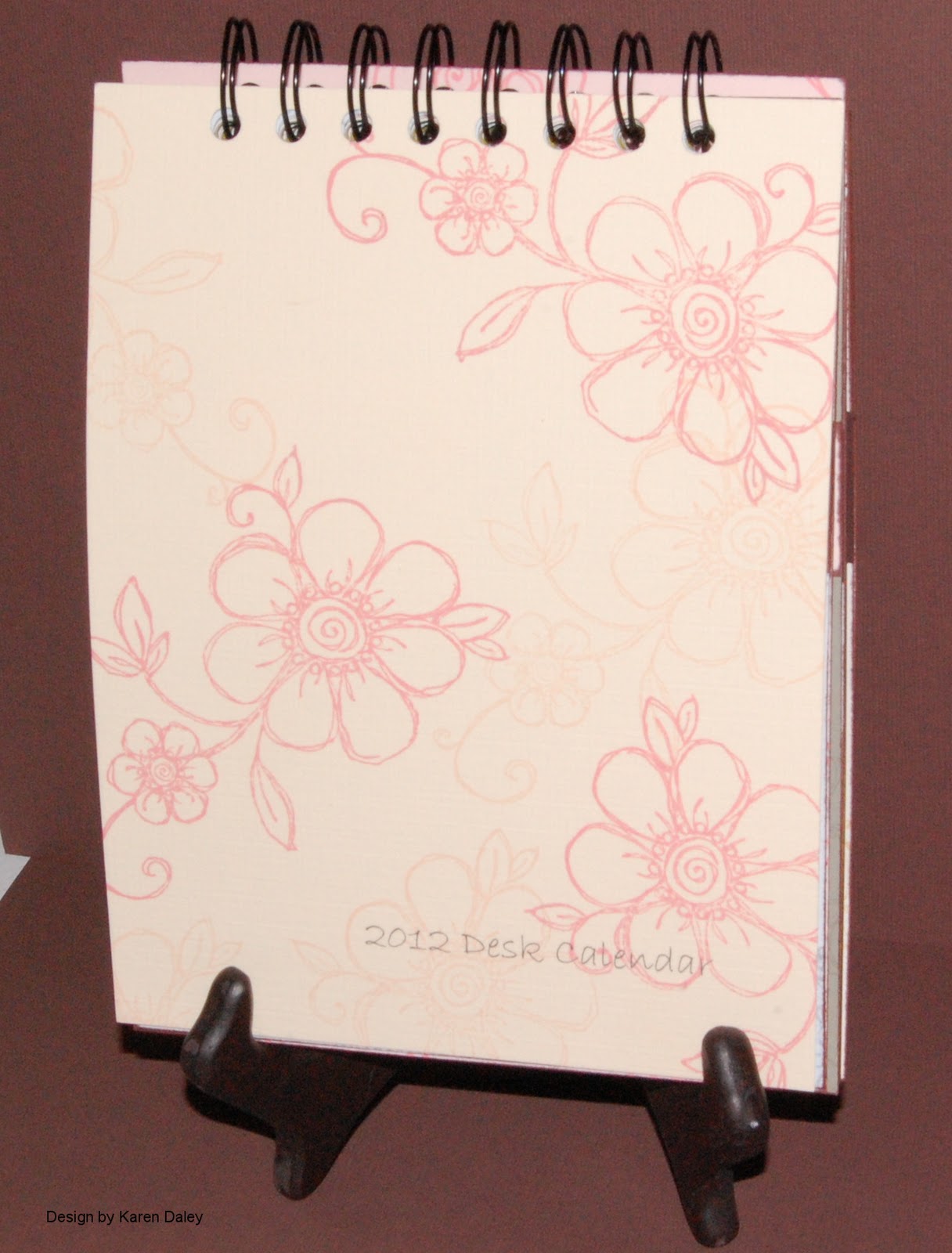
| Calendar - closed |
Hello! Happy New Year! Hard to believe 2012 is upon us, isn't it. Here is my first class this year at
Heather's Stamping Haven - a 2012 desk calendar. It will be a two-part workshop on
Saturday, January 14th. Please contact Heather at the store to register.
In the morning, we will do the images and you will learn the essentials of Krista Schneider's popular technique for watercolouring with Tombow markers. In the afternoon, we will make the calendar
pages and assemble the calendar.
 |
| Calendar open to January 2012 |
 |
| Calendar Pages |
I really had fun making this calendar and I would be hard pressed to pick a favourite page. I think I could narrow it down to three contenders: the bunny, the witch, and the poppy. I used Sunshine Designs and Heather's Stamping Haven images as they lend themselves so well to the technique, but also because there is tremendous variety to choose from, seasonal and floral and birds...gorgeous. This calendar also has two bonus pages for 2013, which presented some challenges to DH to understand (in his engineer's world, calendars have 12 months you see). I said it was because years are only randomly selected points in time, roughly timed to include one trip around the sun and any old pope can make one up. Plus, we are making this later in January, so the two extra months are to make up for that. Also, a calendar that will go to February will allow people to purchase their 2013 calendars at deep discounts in February, thus offsetting the cost of the class. He remained unconvinced. I, on the other hand, thought it was great to be able to include the extra months, which is the whole reason you *make* things, not buy them, because then they get to be how *you* want them.
Hope to see you at Heather's on January 14th! It's going to be a great class and a lot of fun.


 Hello! For the past couple of days I've been playing with my stash of Japanese paper. I had picked up a big bag of scraps, so I used those to make about 17 or so cards. Here are two examples. For all of them, I punched a vase (punch from Carla craft) and stamped the bough+flowers (Impress Rubber Stamps) on a 2x3 3/4" piece of neutral cardstock. I used the colours in the vase to determine the colours of the flowers, and the background accents, etc. I found some wonderful scraps and these are two of my favourite cards. When they were bright and cheerful like this, I made them into birthday cards, Mother's Day cards, thank you cards, etc. More muted tones and purples I turned into sympathy cards. Almost all the card bases are the wonderful tsumugi cardstock that comes in such beautiful colours and has such wonderful texture, reminiscent of slubbed silk. For the purple card, I only had a tiny scrap of the vase paper, but I found another tiny scrap of the red and white and black that looked nice, and a bigger piece of the crumply paper. On the blue card, I used an Oriental calligraphy stamp (Fred B Mullett) in the background. (It's the stamp that has the poem about the words like stones and youthful tongue growing gray.) The green card is a Mother's Day card, with the sentiment on the front (Stampin' Up) and a lovely quote on the inside with a Quietfire Designs calligraphy stamp.