Saturday, 2 October 2010

Peeking Pumpkin


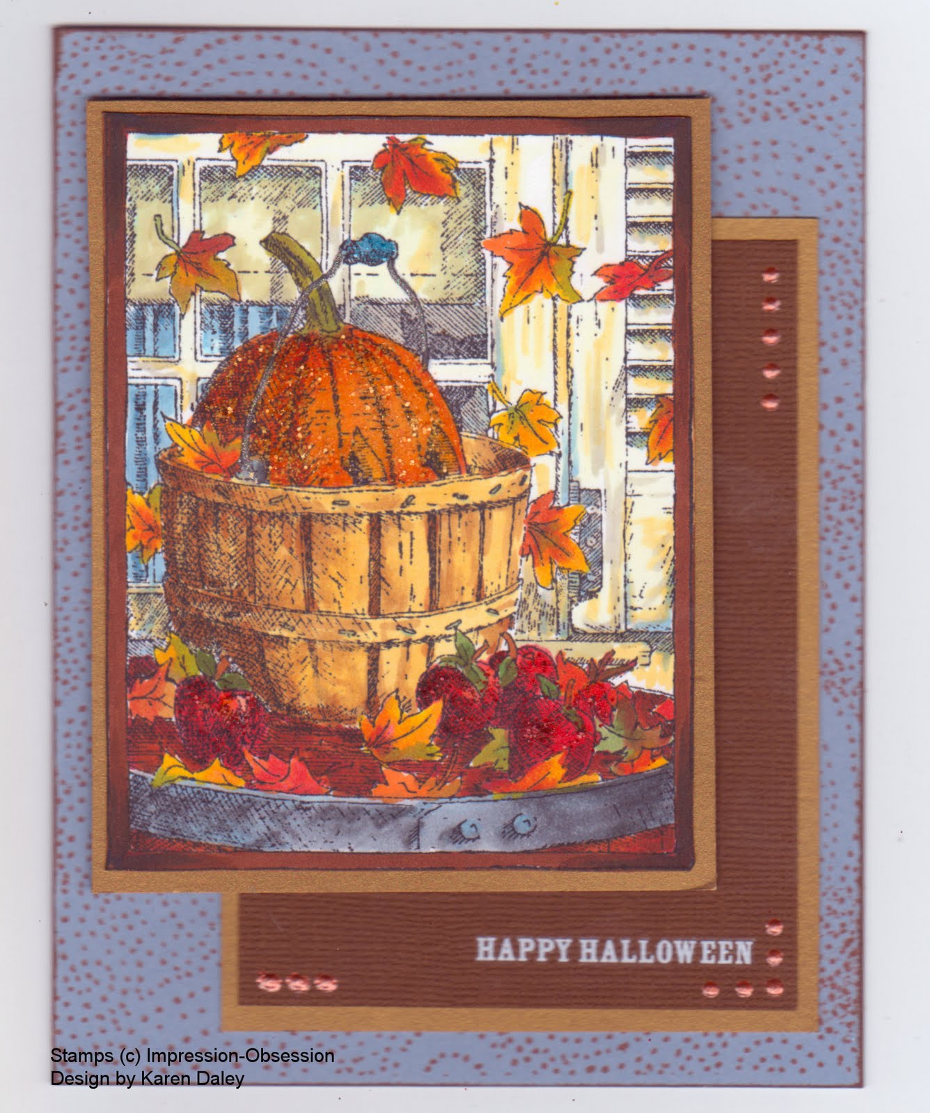
I made this card for an upcoming Impression-Obsession challenge, which is a colour challenge: coffee, pumpkin and nutmeg. I stamped the image (Peeking Pumpkin, H1792) in Memento black on Neenah white paper and coloured with Copic markers. It's been a while since I've had them out, so it was fun get reacquainted. This is a fun image to colour - all those leaves and details. I have another one stamped off that I want to try in pencil crayon. The pumpkin is accented with Spiced Marmalade distress stickles, the apples with Fired Brick, and the handle with Broken China. The card base is Bordering Blue (one of my favourite SU colours, now retired, and stockpiled in my cupboard). I stamped it with an I-O background (Fluff) in Palette ink (Burnt Sienna) for the nutmeg element. There is some dark brown in the border for the coffee element, and of course there is a pumpkin. I had meant to incorporate Early Espresso paper, but it didn't work out. I suppose the Bazzill paper that has the Happy Hallowe'en rub-on is the colour of instant coffee grounds. Whether those count as coffee is a debate for another blog. The final accent was some terra cotta dimensional pearls. Heather just got in some Viva Decor Pens, which are similar to dimensional pearls and I got a colour to try out. They seem more robust than the pearls, which tend to get squashed, no matter how long they dry.
Well, it's long past bedtime, so I should toddle off. Morning will come soon enough and I'll need to dream up breakfast for three kiddies before I swan off to a stamping class. I'm taking a neat looking one where we'll be playing with the metal stuff and all those tools from Ten Seconds Studio. It's going to be fun! I won't have my zombie class in the afternoon. Sadly, my gamble went bust - turns out there are not droves of stampers in town dying to turn Magnolia into a zombie. Oh well, it meant I could make this tonight instead of prepping for class so there's a pumpkin lining to that cloud!
I will be doing a class on Nov 6th, a gothic arch triptych Christmas card, which features exactly zero Magnolias and zero zombies.
Thanks for stopping by!

Wednesday, 29 September 2010

Gothic Arch #14 Numbers


This is Arch #14 for the Inkurable Stampers Gothic Arch Challenge. The theme is numbers. I hemmed and hawed, and then I got that lovely zing of an idea, that flash of inspiration that is so addictive, and what I really love best about all this. The tricky part is always in the execution. I'm moderately satisfied with the execution here, and like it well enough not to do over.

I started with the germ of an idea, "The four chambers of the heart", with the four members of my family in filmstrip form. I printed off the pictures (resized and b/w'd and all! Look who's driving now, Paint Shop Pro!) and tucked them under some filmstrip I had stamped another time on some acetate. I used a bit of glue pen to hold them in place before I glued the whole thing down with double sided tape. But first, I stamped the background, the harlequin and hearts (Stampin' Up) and my current favourite scroll stamp by Tim Holtz (Stampers Anonymous). The inks I used were Stormy Sky and Pumice Stone. The 4 and heart are grungeboard, the former was treated to distress ink, but I settled on black paint. The heart I painted pearly white, didn't like it, embossed in red tinsel, but white showed through, so re-embossed with red ink and red tinsel powder (lest you think these things come together in one seamless flow!). The words are printed off on the computer and I don't really like the paper. Note to self, don't cheap out - use Whisper White! The difference shows! I felt it needed more red accent so I blobbed on some dimensional pearls in little heart shapes and called it a day! (Well, called it a late night actually.) So there you have it. Numbers. The next arch is "keys" and I am struggling with a recalcitrant escutcheon..... It has been painted, distress embossed, painted again, glared at and sent to bed to think about what it's done. It will be allowed out when it is ready to cooperate with the other embellishments.


Tuesday, 28 September 2010

Gothic Arch #13 Christmas


This is my Christmas arch, another watercolour with Adirondack colour wash treatment. I didn't have the Red Pepper and found the Cranberry a bit purple, so I mixed some Ruby Red reinker with water in a mini mister and made my own red colour wash. The other colour used here is Lettuce. I also had a bottle of something (Weathered Wood reinker I believe) mixed with some Perfect Pearls, so that got sprayed on top and gives a lovely sheen.

The Santa image is a Tim Holtz stamp, and it's stamped in Versafine, as is the holly border (Heather's Stamping Haven) and the words (Stampin' Up). I bleach "painted" again to highlight the santa, snowflakes, etc. The holly is coloured with Tombows and I made the accent holly from green velvet paper scraps, dew drops, and a charm from the stash. Not my favourite arch, but I'm a woman with a mission. I am also Christmas-arched out after doing more versions than I care to count to develop a class sample.
Thanks for stopping by!

Gothic Arch #1 Butterflies


This was the first Inkurable Stampers Gothic Arch Challenge theme - Butterflies. I joined the challenge several themes in, and have been working my way back. Now I'm caught up in that direction, and will resume at #13, Christmas, but that will be another post.
For this arch, I took some watercolour paper and sprayed it with Butterscotch and Lettuce Adirondack sprays, heat setting and spraying to get the intensity I wanted. (I used some water too, to move the colour around.) Then, I stamped the sprig (Stampin' Up) in India Ink and 'painted' the flowers with bleach. The word stamp Papillon (Quietfire Designs) is stamped in Wild Honey. THe other word stamp is a Tim Holtz - Stampers Anonymous image. The butterflies are punched out of a glossy black scrap that I had been experimenting with a Hero Arts stamp and some mica gloss. That experiment didn't work, but they look nice punched out here. Lastly, I doodled a border around the edge with a fine point pen. Quick and easy! I am really enjoying those spray colour washes. They are fun to do. I did another one, that I'll be using for one of the other arches. I'm going to binge out on arches tonight since work is about to get totally crazy. I want to stockpile some good stamping vibes before I go under. It's going to be emergency stamping rations only for the foreseeable future. It's a vicious circle though, since the crazier it gets at work, the more stamping I need as antidote, but the less time I have for stamping but the more I need it. So, raise your ink pad to toast an evening of stamping. How many arches can I get done?
Thanks for stopping by!

Monday, 27 September 2010

Gothic Arch #2 - Lace


This is Arch #2 - Lace from the Inkurable Stampers Gothic Arch Challenge. I wanted something soft and vintage looking to go with one of the few bits of lace I have around. I found this wonderful (repro) vintage French soap label in my stash and immediately fell in love with it. I picked up on the reds in the clover with the background arch (Cherry Cobbler) and added some clover stamps (Sunshine Designs - The Stamp Barn) embossed in Garnet. This embossing powder has reds, gold and dark purples in it - gorgeous. The dark colour is a very dark green, to pick up the leaves, and I also punched a corner scroll and trimmed it to fit the top of the arch, which needed a little something. The bee (Anna Griffith) is stamped in versafine and sponged with Antique Linen. This might be one of my favourite arches so far, with the reds and the pretty clovers. And I learned a new French word!
Thanks for stopping by.
PS. We watched the Simpsons season premiere last night. I don't know what made me tape it since we haven't watched the show in three or four years, but I did. And guess who the guest stars were - Bret McKenzie and Jemaine Clement, of Flight of the Conchords. A little bit freaky! It was really funny - they were art camp counsellors, with lots of their trademark guitar & comedy.

Sunday, 26 September 2010

Gothic Arch #3 - Crowns


This arch is for the Inkurable Stampers Gothic Arch Challenge #3 - Crowns. This arch started the background, where I began with some watercolour paper and the crown (Stampin' Up) stamped in white paint. I sprayed on some water and colour (Eggplant, Cranberry, Butterscotch Adirondack Colour Wash) and heat set. I had to rub the colour off the crowns a bit - the paint doesn't do the same level of resist as clear embossing. Then I stamped on the flourish (Stampers Anonymous) in Dusty Concord and the crown in Encore Gold. This background was so colourful that it needed something bold to go on top, and I remembered this frog princess stamp, which seemed to suit the occasion well. She's stamped on Heather's 180 lb paper in Graphite Black Brilliance ink (heat set) and coloured with Copics. The crown is adorned with tiny crystals and she is embellished with some stickles as well (Magenta on the lips, possibly a bit tarty for a real princess, but this one's in a mood for celebrating). I also added some clear glaze to her eyes to make them nice and glassy, which I guess is the froggy equivalent to false eyelashes. She needed a "ground" and velvet seemed a regal choice, so I embossed a piece of green velvet paper for her to sit on. The words say "celebrate your inner princess" (A Muse) and they are embossed in white gold embossing powder, for a very disco glitzy effect. (Not so much for this effect exactly, but because my gold powder, located only days ago in a big tidy, is currently hiding.) The brads at the top (Stampin' Up) started out silver, but I coloured it with my gold leaf pen (Ranger) to match the gold elsewhere. [I have been less than thrilled with this pen. Has anyone else had trouble with it? The paint just blobs out the side and won't flow into the nib. Any tips/suggestions?]
Well, better go make lunch for the kidlets. They are getting grumpy and squabbling upstairs. They were really good in church this morning, so I suppose I should feed them before things escalate.
Thanks for stopping by!

Saturday, 25 September 2010

Gothic Arch #4 - Hands


This arch is for the Inkurable Stampers Gothic Arch Challenge #4 - Hands. I am on a bit of an arch binge this weekend! I am trying to get a little less behind. I don't think getting caught up is a realistic goal in one weekend, but less behind is definitely within reach.

My first hand arch was completely revolting. I don't have a lot (any?) hand stamps so I found some mitten stickers and it went downhill from there. Suffice it to say that the Apricot Appeal base did the arch no favours either. However, it will be just the perfect thing to cheer up a little girl's lunchbox though, in the fullness of time.

Anyway, on-line I went to find a nice hand image, and the Graphics Fairy didn't let me down. This image made me think of love letters, so that's the theme I went with. The arch is made of Certainly Celery cardstock, stamped with a lovely handwritten letter background stamp (Heather's Stamping Haven) in Weathered Wood, then stamped down the side with a Tim Holtz image (Stampers Anonymous) in Aged Mahogany. I fell in love with this image - it nests on itself, looks great alone, it's a little vintage, a little bit hip, a little bit country and a little bit rock and roll. It's going to be on my desk all the time I think, right next to my sequin waste. I added a bit of decorative tape (there are actually more pieces underneath the panel, victims of the "planning? what planning?" approach). I trimmed out the image, and glued it to a piece of Bravo Burgundy, which I sponged with Aged Mahogany distress ink and stamped with that newly beloved image. In keeping with the love letters theme, I stamped "Amour" (Stampin' Up) in white paint, stamping several times without reloading. That got put on and I remembered I got out my nib stamp, for the letter theme, and added that stamped in Shabby Shutters. I thought about what words to add, and didn't have a "love letters" stamp, and dymo labeller didn't seem called for here. I went to my lone vintage novel, and despite its dreary content, it did have some letters in it so I clipped out the closing salutation and glued it down, feeling quite pleased with myself. Lastly, I added some pencil crayon to deepen the rose and some rock candy stickles to accent it. Then once again lastly, I added the gingham bow, Tim Holtz safety pin, and smudged the stickles (aforementioned feeling dissipated somewhat). Then finally lastly, I added the round brad at the top. I scanned it in, so it must be done!

Thanks for looking!