Showing posts with label Copic markers. Show all posts

Wednesday, 16 October 2013

October Stamping Challenge #9

This card for the October Stamping Challenge came together very quickly.  I found a leftover piece of 130 lb. smooth white cardstock, cut it down to size (card front is 3 3/4 x 4 1/2") and stamped this pretty floral image (Hero Arts).  I thought I was grabbing Tuxedo Black Memento Ink, so imagine my surprise when it came out purple!  It turns out I'd used Paris Dusk.  I quite liked the result so I went with that for my colour scheme and chose a selection of dusky purples for the flowers, with a hit of chartreuse for the leaves.  The sentiment banner is a Memory Box stamp, also stamped on a scrap with the same Paris Dusk and coloured over with the greens from the leaves.  It's popped up on foam tape.  How nice of the Memory Box people to size the banner to wrap the selection of stems of the Hero Arts flower!  Or perhaps it was the Hero Arts people planning the stems to fit in the banner.  Either way, I really like how it turned out!  The final accent were some Dark Blue stickles to go in the centres of the flowers.  This card was really, really fast and a lot of fun.

Happy stamping!

Edited to add:  I used Copic markers to colour the image, and the sentiment banner.  I don't recall which ones - just grabbed ones that looked like would work and went for a variety of similar tones.  

Friday, 31 May 2013

Mixed Media Poppies

Here's where I was tonight!  At Heather's Stamping Haven taking a mixed media class from Krista Schneider (standing).  We had so much fun.  These poppies were a blast to make.  We created them on birch panels with Copic and Tombow markers and Inktense pencils.  All this after a day of doing wonderful watercolour painting with Tombow markers.  I'm worn out, but in the best way.  Thanks Krista, Heather and all the ladies in class for making today such a wonderful day! 

Now I'm off to pack up my Copics for tomorrow' class!  If you are interested in seeing the class samples, the Tombow class is here and the Copic class is here.  There are also another couple of great classes on Distress markers and Inktense pencils. 

Sunday, 23 October 2011

Windy Day


Hello! What a wonderful couple of days at Heather's Stamping Haven, taking Krista Schneider's workshops on colouring with Tombow and Copic markers. Eighteen projects later, I'm worn out but enjoying the creative intensity of the last two days. Friday was a day off from work (!) and Tombow markers. We did 11 Christmas cards and fell in love with lots of stamps and colour combinations. Saturday was 8 projects and lots of great Copic colour combinations to try out. This particular card was one of my favourites and it is such a great image from The Artful Stamper. This stamp was discontinued for a bit, but they have brought it back. Yay! If you can't find it at your local stamp store, get in touch with Heather and she can probably get it to you.


The top left card is the one that Krista taught us, but she said it would be great in all sorts of colour combinations, especially a monochromatic with a hit of red for Christmas. I thought that would be fun too, but I owed my family some time. So I came home and played with the kids for a bit after supper. We alphabetized my chalk re-inkers as I had dumped the box (a second time, immediately after sorting them and was too fed up to re-sort). It was great fun. My five-year-old particularly enjoyed it. (We are quite the party family. Who likes to rock the party? We like to rock the party.) They loved that so much, they begged to alphabetize something else so we alphabetized my stickle drawer. This is quite hilarious given the rest of my stamp room which, although tidier than it generally is, is not exactly organized to military standards. An alphabetical stickle drawer in my stamping space is sort of like having a flashmob where only two people in the crowd are singing the same song. (Speaking of flashmobs, it was one of my New Year's Resolutions to see one and I still haven't. Do you have to be Twittered to find out about them? Because I am not signed up to Twitter. I use another social media interface for the purposes of playing Scrabble and "liking" cool Stampbord projects but I can't see myself joining something else just to see what #twitspace is going on in 45 characters or less. I tend to prefer formats that allow for lengthy ramblings. Hah!)


** Back to the cards! (Click the image to see it in a larger version.) After the kids were in bed, I coloured up a few more and mounted them. I made a pastel one (top right) and a blue-grey one (bottom left, love that one!) and then finally channelled Krista a bit to do the last one, the monochromatic one with hits of red (bottom right). I didn't want red leaves, so I drew a few birds on with the Copic multiliner and coloured them in. For the snowy scenes, I used Rock Candy stickles on the snow, and then coordinating stickles from my (temporarily) alphabetized drawer. I confess they are no longer completely alphabetical (sorry LH!), but the drawer wasn't full enough too keep them from sliding out of order. I don't know which confession is worse: I have enough stickles to alphabetize, I let them get out of order within hours of being sorted, or I don't have enough to fill a drawer all the way to the back. Actually, I like them all in a tumble-jumble because I can rootle through them and re-acquaint myself with all the options whenever I am looking for one. If they're all standing up, I just zoom to the one I want, and forget to notice neglected colours.


Thanks for stopping by! Hope this makes you think about different ways to colour an image to create different results.

Thursday, 6 October 2011

Copic Poppies


Hello! It's been a while since I've posted - I've been busy cleaning out the stamp room, and the computer has been in use during blogging hours. But this week the stamp room got clean enough to stamp this poppy image (Hero Arts), and colour it while watching tv. I tried out some new things I learned at the Intermediate Copic class, things like shading and shadows and different colour families. I am still no expert on shadows and shading, but will claim that my main source of light comes from some direction, and then random other sources of light and shadow may also come into play depending on the backstory of my image. So, for example, here, the sun is coming from more or less above, except for the parts where there was a child playing with a flashlight, and another part where another child was casting shadows. You see, if you can imagine a light source, you can imagine all sorts of things. (You are beginning to see why I have not yet been plucked from Copic obscurity and brought to design team fame and glory.)


Anyway, coloured up the poppies while watching Strike Back and seeing Sgts Scott and Stonebridge shoot their way out of this week's (seemingly) certain death. Not normally my sort of tv, but Sgt Stonebridge is extremely easy on the eyes and they do a cliffhanger every week that brings me back. We are on Story Arc #51 of Plot #3 and it's only 5 episodes in. I tell you, not much time to dither between YR31 and R02 or you will lose the thread completely. Oh yeah, it's the hunk shooting his way out of a sticky situation. So far the main difference between episodes seems to be which country he is shooting his way out of and which babe his sidekick is tomcatting around with. So far it's been India, South Africa, the Sudan, and Kosovo (or brainbox, blondie, Irish exhibitionist, doctor, journalist).


Oops - got a bit side tracked there. Back to the card. I masked off the poppies (just the flowers) and stamped the background music (Cornish Heritage Farms scrapblock) in Antique Linen distress ink. I also sponged in some Linen and Vintage Photo around the edges to soften the white paper (too stark). Decided a poppy should be popped up and coloured up another one. It's trimmed to 4"x5.5" so I could have a strip of red fleck down the side (I believe the paper is called poppy fleck - meant to be!). The sentiment (Papertrey Ink) is heat embossed in black, and the accents are Cello Glitter Ritz (Art Institute). Clearly I am a philistine since when I ordered it, I thought it might be clear glitter, as in cellophane. It's a lovely rich brown, as in cello the instrument. Edited to add: Copics used for poppies: YR31, YR02, R22, R08, E19; used for stems: BG93, YG93, YG97.


In non-stamping related news, my five-year-old washed the dishes tonight. She loves being helpful, so I thought I'd give it a whirl. She did a great job. I did the sharp knives and really grubby/heavy things, but she did all the little lunch containers and things like that. I was so proud of her!


Thanks for stopping by.

Sunday, 18 September 2011

Birthday doodle birds


Hello! Here's a birthday card I made that was inspired by birds I saw on the blog Stamping Mathilda here. If you would like to make your own doodle birds, here is a link to the tutorial on
Delphine Doreau's blog. They are really easy to do, just have fun! I drew these on Papertrey white cardstock using a Copic Multiliner, and coloured in with Copics. I was at the Intermediate Copic class on Saturday so I am all revved up about my Copics right now. I wish I'd used my 130 lb cardstock from Heather since the Copics bled right through the PTI stuff. I lined the inside of the card to hide it, but I had been hoping for a one-layer card. I didn't have time for Stickles to dry since I was delivering this to the birthday girl right way, so I used Sakura glitter pens. Clearly I didn't wait long enough for those to dry as the keen-eyed observer will see where the red one smudged on the crown. I also accented the birds' eyes with the black Sakura glaze pen. The stamped "happy birthday" is from A Muse. I loved doing these blobby birdies - so much fun! And there will never be another birthday card just like this one. I am going to enter this card in the Simplicity One-Layer card challenge here.

Thursday, 30 June 2011

Summer Card Camp Week 1

Hello!

As you can see by the image below, I'm doing the summer card camp I saw advertised on Jennifer McGuire's blog (link in sidebar). This week's colour challenge is shown below and was a real stretch for me, as I don't normally go for such bright colours. But that's what challenges are all about - stretching creativity.




Here's the card I made, with a stamped image on Heather's 130 lb cardstock. I will have to check where the image is from, but I got it at Heather's Stamping Haven.


I coloured it with Copics, keeping to the scheme, and added some pencil crayon for depth, and stickles for sparkle. The orange piece is embossed, and the sentiment (Stampin' Up) is punched with an SU punch and accented with the perfect Swarovski crystals - they are pink or purple or orange depending on how you look at them. The card base is rich razzleberry and stamped with a dotty flourish (Impress Rubber Stamps).


Thanks for stopping by!

Sunday, 26 June 2011

Colouring, colouring and more colouring!


Hello! I've been doing some therapeutic colouring lately while watching tv with hubby. I stamped off a bunch of images (Sunshine Designs) with Memento Tuxedo Black onto Heather's 130 lb cardstock and coloured them different colour ways with Copic markers. Last night I had a few minutes while hubby was working on some committee stuff, so I took some time to turn them into cards. Basic formula: find matching cardbase and Basic Grey paper, mat, layer, etc. and finish off with Stickles and Dimensional Pearls. The big flowers got a sentiment in the white space (Stampin' Up). I think my favourite is the yellow flower card. My nephew's favourite was the blue flower card. I sprayed some Delphinium glimmer mist on the background paper for some subtle sparkle in the background. If you're interested, the coloured papers from top to bottom are: PTI lavender moon paper with pattern from BG Kioshi; Stampin' Up Really Rust with paper from BG Scarlett's Letter; Heather's dark purple cardstock (and a SU Sage Shadow mat) with BG LilyKate; SU So Saffron card base with paper from BG Perhaps.

NSR: Just finished reading a Kate Atkinson novel, Started Early, Took My Dog. It's the 3rd or 4th Jackson Brodie mystery and it was really good. Dark, but with great dashes of humour here and there. Also, her books always weave together numerous threads that are seemingly unrelated.

Sunday, 10 April 2011

Colouring with Copics


Hello! Here's a card I made out of a piece I coloured up with Copics one evening. I couldn't get it to scan well - in real life it'q quite soft and pretty. On my monitor it looks a bit garish. For a reference, the cardstock is PTI's lavender moon, and the background paper is from the Kioshi line (BasicGrey). The stamp is by Penny Black (gossamer?) and I stamped it in either Memento tuxedo black or Brilliance graphite black (heat set). I did up a batch of different images and used one or the other ink since my little Memento was drying up. (I have a reinker now! Yay.) Anyway, I played with the Copics trying to go for a soft purpley pinky orange look to the petals, which was somewhat achieved in real life. I am less happy with my choice of stickles, but that's ok. Another doodled frame, which I seem to be doing quite often. This is one of my favourite images from Penny Black, but I think I say that about all of them.


I have a few different projects on the go at the moment. I picked up some Shimmer Sheetz and am playing with those at the moment - lots of fun and lots of possibilities. I am also working on my May class sample, a few ideas there and some of the ideas even seem to be going somewhere. I have no trouble stamping when I can just sit down and play. When I have to use a certain thing, I often get a creative block. It's weird.


****One last thing, if you're in the area and want to take my class on Saturday morning (April 16th, 10-12), please call Heather to sign up. I'll be showing how to do quick and easy collages by turning ATC-sized stamps into cards. There are a few little special touches for adding texture and dimension that may surprise you. Give Heather a call by Thursday to register.


Thanks for stopping by!

Monday, 21 March 2011

Birds


Hello! I've been fooling around with my Copic markers lately, colouring in a bunch of stamped images. This image is by Stamps Happen and I coloured using a whole bunch of different markers, too numerous to mention. I will say that the scanner makes it look greener than it does in real life. Also, I discovered that my mother was right (but ssshhhh don't tell her I said that) - if you add the complementary colour on the colour wheel, it will make your main colour look more interesting. Case in point the blue on the birds looked really flat despite me having used at least four or five shades of blue and gray and purple (sorry no before and after shot). Probably more like six or seven. Then I added in some orange (opposite on the colour wheel to blue) and bam! - brought them to life. You don't look at it and say "blue and orange birds??", you just see texture and depth and it no longer looks flat. Who'da thunk??? So the next time your Copics are looking a bit flat at lifeless, add in a bit of an opposite colour and see what happens. It's pretty neat. Mind you, I like my Copics to look more artsy and less comic-book, so if you prefer a purer the 3-colour effect from light-med-dark of neighbour markers, then this might not work for you. Myself I quite like the almost painterly effect. Plus with Copics you can add and add and add for hours, shading all through the final episode of An Idiot Abroad and all of Top Gear. I will confess to having started watching Top Gear, after having ignored it for years. I thought it was all a bunch of know-it-all men spouting off about cars. Well it is, but they also do hilarious stunts and two of the three are quite entertaining to watch, and the stunts they get up to are really fantastic. Almost Red Green-esque in their execution (Canadian ref., sorry). The third requires significant amounts of Copics and colouring to tolerate. Also, it's kind of fun to watch people who are so clearly passionate and knowledgeable about an obscure topic like cars. It kind of reminds me of when we stampers get going around the table discussing more mainstream hobbies, comparing the relative merits of this ink or that and how different heat tools perform in various conditions. Also we've been watching An Idiot Abroad with Karl Pilkington, which is quite good, if you like that sort of thing. Think the Lonely Planet but instead of Ian Wright getting all involved in the local culture, picture more of an Eeyore personality literally choking down some local delicacy or making some ascerbic observation with a wickedly deadpan comic delivery.
And back to the card. It's stamped in Memento black, coloured with about 3000 copics, on Heather's 130 lb cardstock. Edges sponged, matted to soft gold glossy cardstock (with a nod to the incomparable Jo Capper-Sandon, see sidebar for her blog, where you will find marvellous creations, several with gold mats like this), mounted on Crate paper card, stamped with a border stamp (The Stamp Barn). I also put glossy accents on their little eyes for some shine, but decided against stickles, though I may change my mind. I do have the new colour of medium blue that might look great on them. Or it might compete with the mat. I'll decide tomorrow.
And with that, I'm off to bed. Thanks for stopping by!

Tuesday, 28 December 2010

Bellarific Zombie


It's not too often you need a zombie Christmas card, but I thought this Penelope with her prezzies (Stamping Bella) would do just nicely. I "enhanced" her with some stink lines, bugs, beetles, worms, and patches and coloured her up in grungy reds, golds and greens for a seasonal colour palette. The layout was for a Bellarific Friday sketch challenge, so that took care of that. The background paper is from last year's BasicGrey Christmas line (Wassail) and distress stickles finished off "the look". She's stamped in memento black and coloured with Copics.

Now wouldn't this look nice on Miss Havisham's mantlepiece this Christmas????

By the way, I do realize it's after Christmas, but technically, we are now in the season of Christmas, it being the third day of Christmas today. So I am uncharacteristically timely. Happy stamping!

Saturday, 18 December 2010

More Christmas Cards


Hello again!

Here are a couple of Christmas cards I made recently. I made quite a number with this image (Stamping Bella), coloured similarly to go with my pack of paper (Jovial line by BasicGrey). I used Copic markers, and then sponged on Antique Linen distress ink to tone the paper from bright white to off white to go with the paper. I also used stickles (Candy cane on birds, patina on dots) and crackle accents (Ranger) on the "boards". I love this image, and it is quite quick to colour up. These were fun cards to make, and good for using scraps of the paper. I edged all the paper with Memories Art Print Brown as well. Well, that's almost it for my Christmas cards this year. They are all (but one, which needs a letter which is only part-way done) in the mail. Now on to the Christmas cleaning and baking. I also want to make some cashew brittle and peppermint bark this year. We'll see how that goes. I also need to wrap presents, but hope to do that while watching National Lampoon's Christmas Vacation. I love that movie! Speaking of Christmas shows, I have been watching the Jamie Oliver Family Christmas shows and they are so wonderful! The food looks delicious, and he is such an engaging presenter. I've also really been enjoying watching his series called Jamie's American Road Trip, which is very interesting. Well, time to throw another load of Christmas laundry (not really holiday laundry, but calling it that makes it feel more special).


Thanks for stopping by!

Wednesday, 6 October 2010

Folk Tree


Here's what I coloured in last night when we were watching TV (rented Wall Street for some 80's memories, thought I don't think I saw it at the time). The image is Artful Stamper, a new image by Krista Schneider. I saw it on her website in the new illustrations and fell in love with it and a few others which I hope to ink very soon. I stamped this on some Neenah crest I think, using Memento black ink. This image is perfect for Copics - nice detail, but the spaces aren't too tiny for those big tips to work in. (I only have the brush/chisel tips, only one of the tiny tip.) I went with a rustic colour palette of red, yellow, green and blue. I went for a quick and easy base: Cherry Cobbler, Garden Green stamped with chalk ink using a Cornish Heritage Farm backgrounder, and a scrap of Pacific Point. All piecses were inked with Memories Art Print Brown. I used stickles to accent (Tiara, yellow, Xmas Red, Crystal) and a PTI button with crochet cotton. I debated the button with hubby, who felt it was unnecessary and distracted from the card. I told him if I wanted is opinion, I would give it to him. He settled on deciding that looking at the button made the tippy tree less noticeable. I told him it was meant to be like that, "It's a folk tree." He just asked where they guy wires were. Sigh. [On the upside, I know what Christmas card I am going to make for him! bwahahahahahah]
Thanks for stopping by!

Saturday, 2 October 2010

Peeking Pumpkin


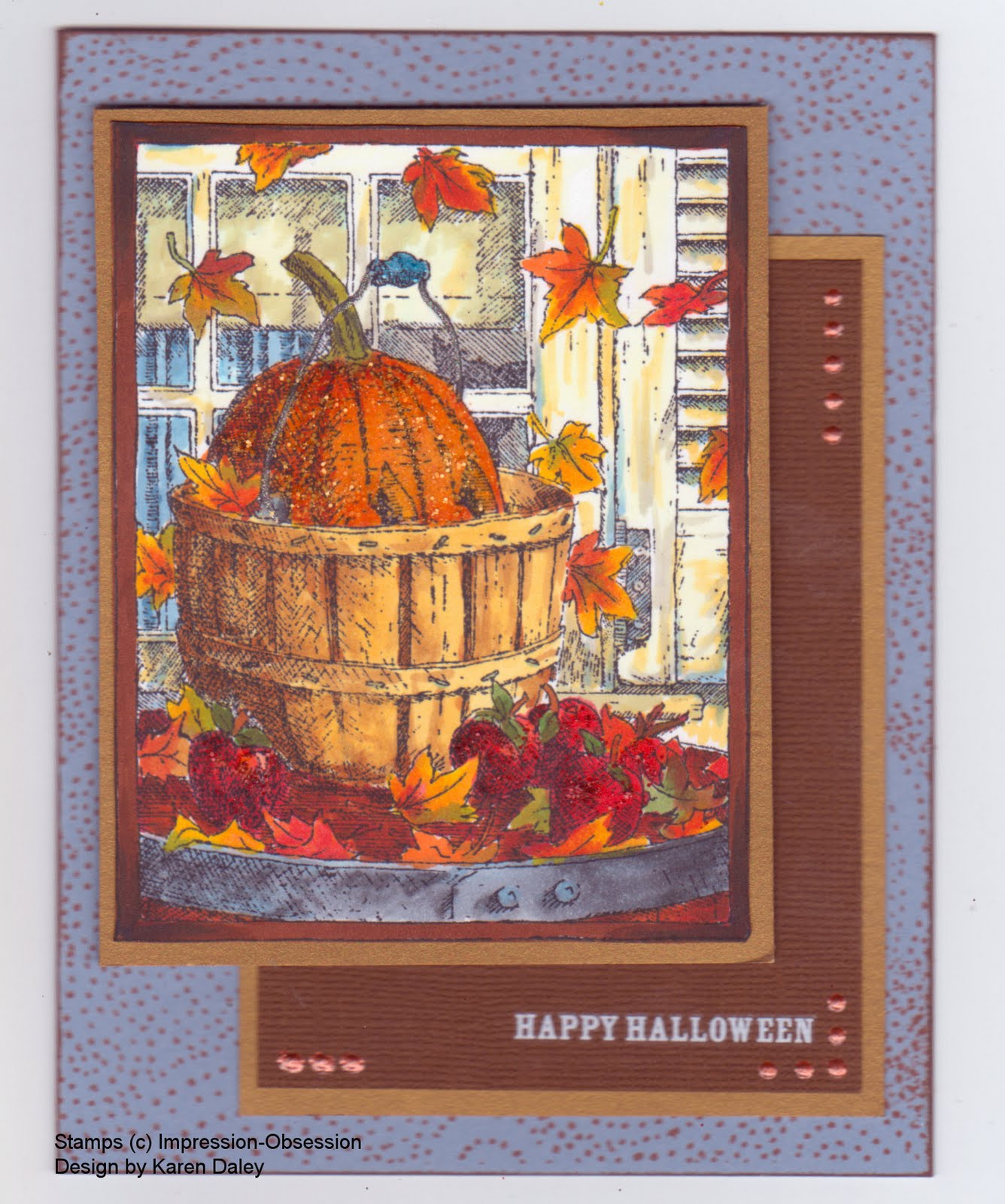
I made this card for an upcoming Impression-Obsession challenge, which is a colour challenge: coffee, pumpkin and nutmeg. I stamped the image (Peeking Pumpkin, H1792) in Memento black on Neenah white paper and coloured with Copic markers. It's been a while since I've had them out, so it was fun get reacquainted. This is a fun image to colour - all those leaves and details. I have another one stamped off that I want to try in pencil crayon. The pumpkin is accented with Spiced Marmalade distress stickles, the apples with Fired Brick, and the handle with Broken China. The card base is Bordering Blue (one of my favourite SU colours, now retired, and stockpiled in my cupboard). I stamped it with an I-O background (Fluff) in Palette ink (Burnt Sienna) for the nutmeg element. There is some dark brown in the border for the coffee element, and of course there is a pumpkin. I had meant to incorporate Early Espresso paper, but it didn't work out. I suppose the Bazzill paper that has the Happy Hallowe'en rub-on is the colour of instant coffee grounds. Whether those count as coffee is a debate for another blog. The final accent was some terra cotta dimensional pearls. Heather just got in some Viva Decor Pens, which are similar to dimensional pearls and I got a colour to try out. They seem more robust than the pearls, which tend to get squashed, no matter how long they dry.
Well, it's long past bedtime, so I should toddle off. Morning will come soon enough and I'll need to dream up breakfast for three kiddies before I swan off to a stamping class. I'm taking a neat looking one where we'll be playing with the metal stuff and all those tools from Ten Seconds Studio. It's going to be fun! I won't have my zombie class in the afternoon. Sadly, my gamble went bust - turns out there are not droves of stampers in town dying to turn Magnolia into a zombie. Oh well, it meant I could make this tonight instead of prepping for class so there's a pumpkin lining to that cloud!
I will be doing a class on Nov 6th, a gothic arch triptych Christmas card, which features exactly zero Magnolias and zero zombies.
Thanks for stopping by!

Thursday, 3 June 2010

Zombie Thursday


What a great day today - I took the day off work and spent it at Heather's Stamping Haven for Krista Schneider's amazing workshops. Today we did two classes on Copic markers and one class on Bruynzeel pencil crayons. I learned so much and such a good time. What a wonderful bunch of ladies to spend the day with!

In one of the Copic classes, we were colouring Magnolias and Krista had a handout with some tips for adding faces for those of us who feel those little cuties need a facial expression. Conversation could tend to get a little silly (who me???) and one thing led to another and the next thing we knew, Krista was giving us instructions for a zombie Magnolia. I couldn't resist, not even a little bit. Here's my zombie! And I have to say that I am delighted to now have an "out" for all my cards where I mess up the colouring - I will zombify them. (Won't dwell on dearth of zombie-loving recipients.....) I love her greenish pallor

Having discovered Krista's pash for zombies, I thought it would be a hoot to make her a zombie thank you card with one of her stamps (the bunny from the Easter cube, Sunshine Designs).

I think zombie cards are a bit like collage - way more fun to make than to look at! (And I am definitely the sort of stamper that gravitates to projects that are supposed to be smudged and grubby.....) This card is all about the grunge and the distressing and the creepy crawlies. I stamped the bunny in Memento black and coloured it with Bruynzeel pencil crayons, blending with odorless mineral spirits. I added in some signature zombie features like the patch and the stitches, flies and stink lines. The main card base is some tsumugi paper in soft green, with strips of torn linen paper for accent (I was going for a mummy-bandage effect). I distressed them with some Old Paper, Antique Linen and Peeled Paint distress ink too) and glued them down with some very nice Italian glue that smells of almonds. What a treat! (I got it at Stamping Bella and it's in a tin with a tiny brush.) The accent panel is Soft Suede (Stampin' Up), embossed with the diamond pattern Cuttlebug folder. I wished I had one of Tim's new folders for this, but I don't (yet!). The "thank you" is an Impression Obsession stamp that my mother gave me years ago. I stamped it with Versafine ink (Olympia Green) and drew patch stitches around the edges of it. I finished off the card with some zombie doodling using my Copic Multiliner - creepy crawlies, a worm, patches, and a millipede (could only bring myself to draw one - those things freak me out!).

So there you have it - a totally unconventional thank you card, but tailor-made for the recipient. I have a feeling she's going to like it.
Thanks for stopping by!

Monday, 31 May 2010

Hero Arts Poppies & Copic Markers


Wow! After spending a week colouring, I have to say that Copic markers are a lot of fun!!! I was recently away on a business trip for a week and reluctant to face a week's withdrawal pains from stamping, I brought some stamped images and my Copic markers with me. My early efforts in the week were quite .... bad. Really bad. I could blame it on the limited colours, but really, it was just limited skill. Still, any new tool takes some getting used to and in my down-time from my meetings, I would colour away in my little hotel room, happily absorbed in choosing colours and learning to blend. I also learned that the very best paper for Copics is Heather's 130 lb paper. I also used paper from another source, but was disappointed. It may work well for the experienced Copic-wielder, but for the novice, it didn't work. Copic novices, use Heather's paper and you will be much, much happier with the results. No matter how much I soaked it, it refused to bleed, and marker lines were quite easy to remove. I thought it would be a great chance to practice, practice, practice my Copics since that was the take-home message from my certification course. Also, it was easy to pack a SU stampbox full of my Copic collection and a few pages of stamped images. I did bring a few stamps with me (my Nuggitz cubes - perfect for travelling - 4 stamps, 1 block) and my black Memento dew drop for some on-the-spot stamping because sometimes I just don't feel like colouring what's there. (This happened a few times on the trip, so it was nice to have some options.) Are you ready call 1-800-LOCKR-UP yet? I do realize this sounds a bit nutty, and I will admit to being somewhat crazy when it comes to stamping (and knowing obscure words/facts/and other useless tidbits), but since I was allowed through airport security, twice, I can safely claim that I am not ready for immediate committal.

The card posted here was one of my later-in-the-week efforts, probably day 4 or 5. (It was hard to scan in the exact colours, the card base is Pacific Point and the pink cardstock is Cameo Coral, if that helps.) I felt a bit of trepidation turning it into a card (I always feel like that about images that really turned out well). However, I wanted to send a thank you card to the meeting organizers and it seemed fitting to send one I made when I was there. Not that they would know or anything like that, but it's sort of like I want to think about it a wider way to soften the blow of releasing one of my special cards to the mercy of international mail and the non-stamping world, it helps me with the separation anxiety to put some sort of meaning to the card-recipient.

About the making of this card: stamped fabulous Hero Arts poppy image in Tuxedo Black Memento Ink on Heather's 130 lb cardstock. Travelled to new city (not essential to card). Coloured with Copics and accented with stickles (Cinnamon and black in the middles, burgundy going out a bit from the middle.) I used several shades of red and pink and brown, probably 4-5 reds/pinks and 2 browns; I remember the blues, B00, B04, B24 - only blues I have right now - will have to expand repertoire as am getting tired of bright turquoise backgrounds as only non-brown option. Just to let you know, I will start as I mean to go on and not post photos of the ends of my markers. One, because I have some Ciaos and the numbers are on the barrels. Two, because it will mean I will never (a) take the picture or (b) get around to uploading it. If I think of jotting down my colours, I will pass them on, otherwise, just figure I used various shades of light and dark of whatever colour you see. If you want better instructions, come take a class at Heather's ;-)


I matted this on black, then cameo coral (SU) and then on a pacific point (SU) card base (5.25" square). I stamped a pretty dotted flourish (Impress Rubber Stamps) on the card base using New Canvas Palette Ink (PTI). I love that stamp - so useful for something pretty and whimsical but still kind of fresh and not too flourishy-bohemian. (I didn't realize I had such definite ideas about my flourish stamps! I guess I do!) I think this poppy stamp would be great done with fiery oranges (sorry Mum!) as I'm seeing lots of lovely poppies around right now in those colours. Also some beautiful pink ones are blooming in the church garden at the moment. I love poppies!

Thanks for stopping by! Hope you find a way to travel with your stamps too.

Thursday, 6 May 2010

Look out Copics, here I come!


Look out Copics, here I come! Not only am I your classic "Late Adopter" (marketing term for someone who is always the last to catch on to any trend), I am now a Certified Copic Instructor!
Last weekend I took an amazing class with Sally Lynn MacDonald and had a great time. Her class was fantastic, despite a few set backs like having all her markers stuck in customs! Anyway, we got the scoop on the Copics (that's a long "o" folks) and am now qualified to teach these babies. To be honest, I wasn't all that wowed at first. Us Late Adopters are deeply suspicious of new things when our old things like Twinklings and Tombows are wonderful and we love them. We don't see any need to change when things are just fine the way they are. We wonder how anything new could possibly be better. (And when it comes to monitors, this may well be true!)
Well, Copics aren't better, but they are different, and they are fun. I found the paper at the certification class a bit hard to blend on, but I've been playing at home on Heather's special 130 lb cardstock and it is practically self-blending. It is super easy to use. We got a little case of markers included in our registration and this card is made with those, supplemented with 2 greens and a yellow. This will be an upcoming class at Heather's, so I'm not going to give away the details here, other than to say this is the second card I made with Copics and I am HOOKED! They are fun, fun, fun.
ESR,JALB (eventually stamp-related, just a little bit):
Last weekend was a dream weekend. DH whisked me off to Kingston for a get-away after work on Friday. We stayed at Green Woods Inn, which I would recommend to anyone who wants a wonderful stay in an amazing B&B in the total lap of luxury. We went out for dinner at Domenicos and it was fabulous. We walked around a bit and enjoyed the sights and atmosphere. I love Kingston - so historic and interesting and you are never more than about 3 steps from a historical plaque. (I am a sucker for historical plaques and will always badger DH to stop and read them if I see any. He often resists since we are usually trying to get somewhere and he is not as captivated by the "Historical Plaque 63 km at next left" signs as I am.) Anyway, Kingston is practically paved with historical plaques, written by the most earnest date-o-phile in Ontario. I digress. The rooms at Green Woods are beautiful, full of antiques and very, very comfortable. The owners are very hospitable and professional, and even remembered where we dined the last time we stayed there (about five years ago). The breakfast was heavenly (yogurt parfait with granola, bananas and strawberries to start, Green Woods Benedict - perfectly poached eggs on Pan Chancho olive focaccia, with sauteed mushrooms and balsamic tomatoes on the side, with fresh croissants and homemade preserves, including the most flavourful pear, pineapple and carrot jam, with an interesting note that I think was cloves, but maybe nutmeg - will have to try to replicate this summer during jamming season - are you tired of this sentence yet??? - could try to extend with further ~punctuation~ of sorts....I would try but I am out of typing breath!). We had a great afternoon browsing around the shops of downtown Kingston. We poked around a couple of used book stores as I was trying to work up to buying an old dictionary for the purposes of diecutting the pages in manner of Tim Holtz. Ed sternly disapproved of these barbaric intentions and to be honest I just couldn't do it. I just couldn't face those book store owners and buy a dictionary for the purposes of wanton destruction. These bookstore owners clearly felt that all these books were somehow extensions of themselves, somehow family members stacked up and piled around for the purposes of maintaining society's knowledge of all sorts of topics, from how to make dolls from plastic canvas to important knots of the 1920s. How could anyone dream of defiling these treasures? I was able to bring myself to buy a couple of old plays and a book of French poetry for purposes of applying these mots d'art to paper projects, but couldn't quite get a dictionary. It was a wonderful get-away and so nice to spend some time with my Dear DH. He also let me go to Marchant's for an hour, a stamp store in Kingston, which was fun. They have a wonderful selection of scrapbooking supplies and I got some interesting Opaline Ink and a Hampton Arts diva stamp, and another interesting Penny Black stamp that caught my eye. I'm looking forward to trying those out. They had a fun little make-and-take with Savvy Stamps too - very cute! Lucky Kingstonians to have all that ink and rubber goodness nearby.
Well, time to hit post and then the hay! So much for an early night but if I dash, I just might make it before midnight. T minus two minutes and counting. Hey - speaking of Two Minutes to Midnight, Iron Maiden is opening Blues Fest! I talked DH into going with me to recapture my youth. Rock on Garth!!!! Blue Rodeo, Johnny Cash, and Van Morrison may be more my thing nowadays, but if Bruce, Steve, Dave and the boys can turn up and play, the least I can do is go and see them.
Stamp credits: flower - Sunshine Designs (The Stamp Barn), plaid - Cornish Heritage Farms scrapblock.